Rabbit Hole #1 — The Twentieth Century, Seen from the Nineteenth Century
And why it seems easier to forecast technology than aesthetics 🚄
What will the future look like?
Well, that’s the topic for a post I’m writing for another publication, so we won’t talk about it here. However, that post was a good rabbit hole generator, so here we are — today we’ll talk about past futurism, i.e. futurism from the past, i.e. attempts to describe the future from some point in the past, which is cool because we can compare with what really happened.
Albert Robida was a writer and illustrator in late 19th century France. His work is classified under the genre of “merveilleux scientifique,” which you could translate as “scientific marvelousness,” “scientific fantasy” or “scientific supernatural,” and which could be seen as the French precursor to Anglo-Saxon science fiction. (Jules Verne is often considered the main writer in the genre.) Robida wrote a few scientific-marvelous (?) novels in the 1880s and 1890s that try to imagine life in the 1950s.
In order to make it more fun for you and I both, he also illustrated the books, so we can just look at the pics.
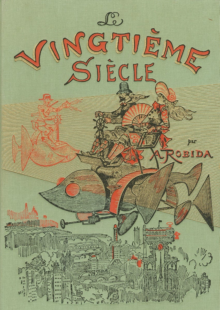
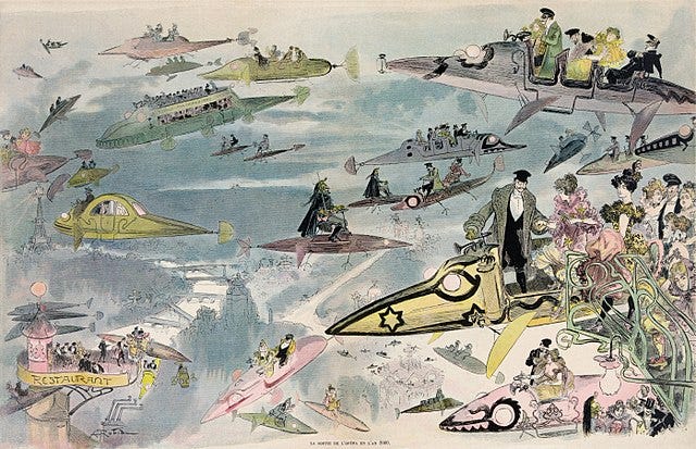
Here’s the cover of the 1883 novel Le vingtième siècle (“The Twentieth Century”):
Okay, so clearly flying cars are a thing in that timeline’s 1950s Paris. Totally unrealistic, right??
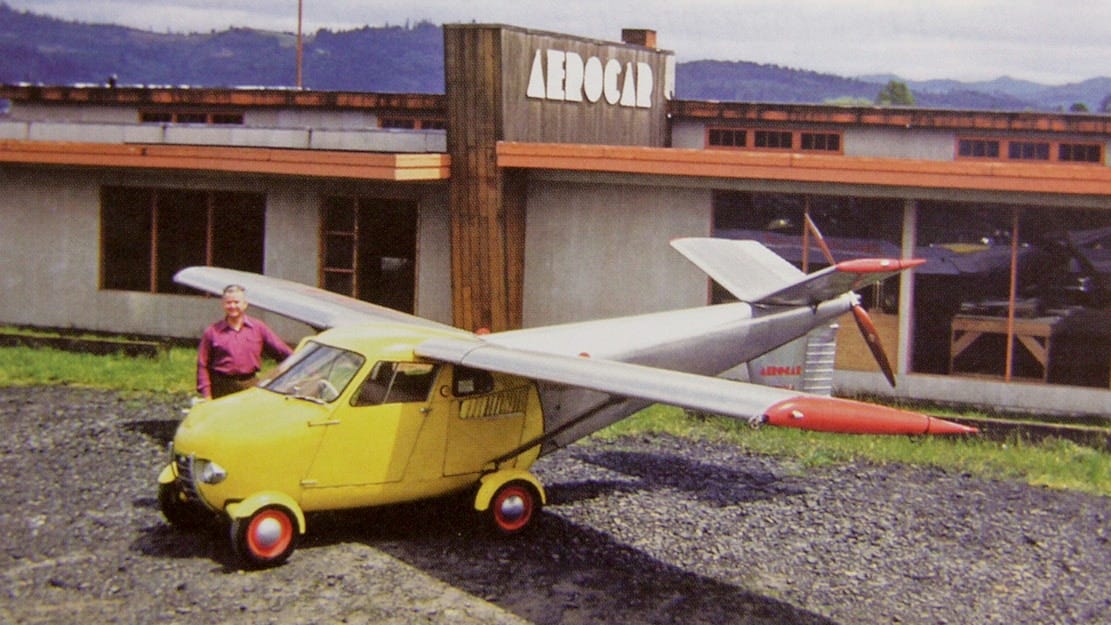
Well:
This is the Moulton Taylor’s Aerocar, “considered one of the first practical flying cars.” I had no idea about this, but it was invented in 1949. Unfortunately it was never mass produced.
So our friend Albert wasn’t too far off! In fact it’s quite plausible that flying cars could have become a thing if things had played slightly differently. At least that’s the sense you get from reading the book Where Is My Flying Car or, like I did, either of these two reviews of the book: review 1, review 2.
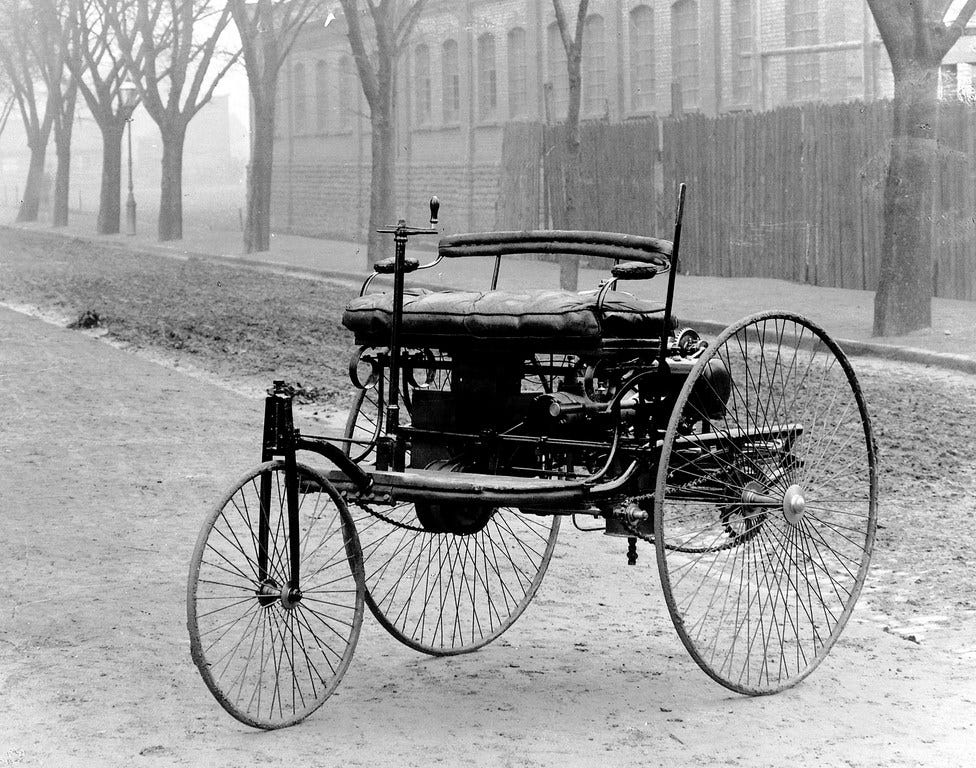
As for the aesthetics, it’s interesting to note that Robida’s flying contraption superficially resembles the Benz Patent-Motowagen, the first production automobile ever.
The Motorwagen was released in 1885, right after the book, so it looks like Albert just went with the aesthetics of his time.
Robida published two more books in the “Twentieth Century series.” There are less pictures online of the second, that focussed on war, but here’s the cover of the third, which delves deeper into the changes brought by electricity.
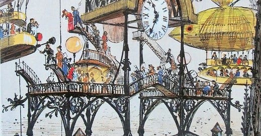
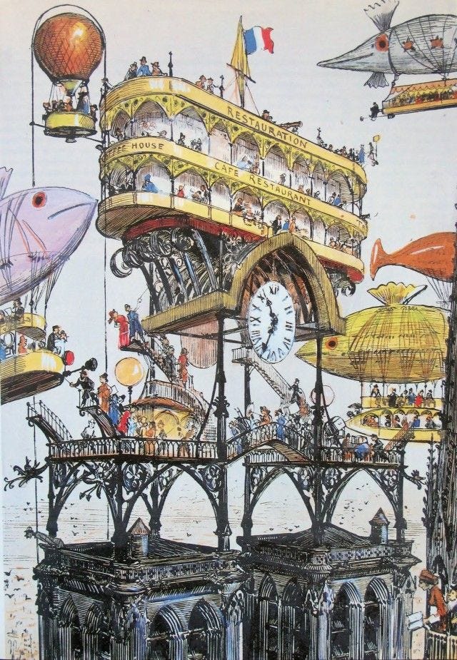
The rest of the pics are a sample of the most interesting ones from both books. This one is pretty iconic: a restaurant at the top of Notre-Dame-de-Paris, which would be accessed using some sort of aerostat public transportation.
Unfortunately, wrong prediction. There was no restaurant atop the cathedral in 1955.
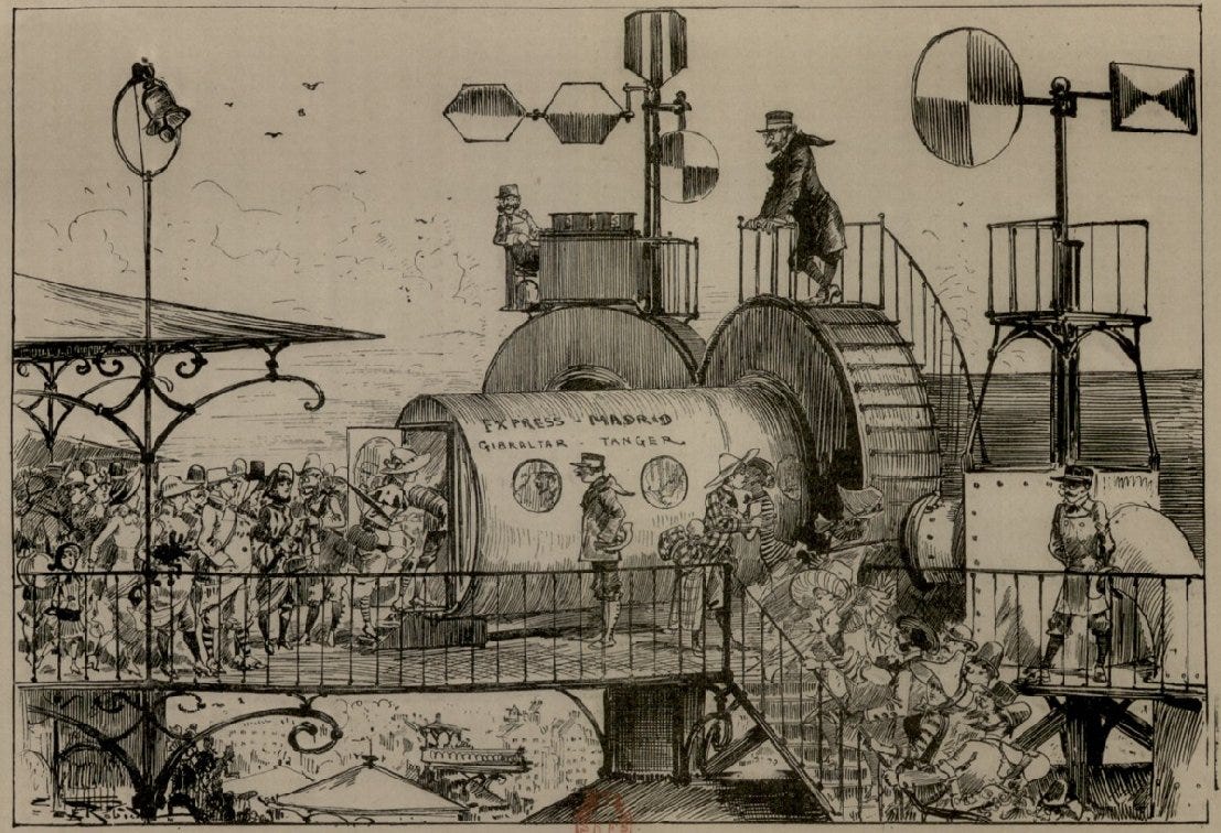
What else is there in the way of transportation? Well, how about the hyperloop:
This was well in advance for its time, given that the first manned hyperloop tests occurred in November 2020. Still! If hyperloops do become a thing, this will have been a pretty impressive prediction.
Speaking of tubes, I also quite like this diagram of the various pipes under a street.
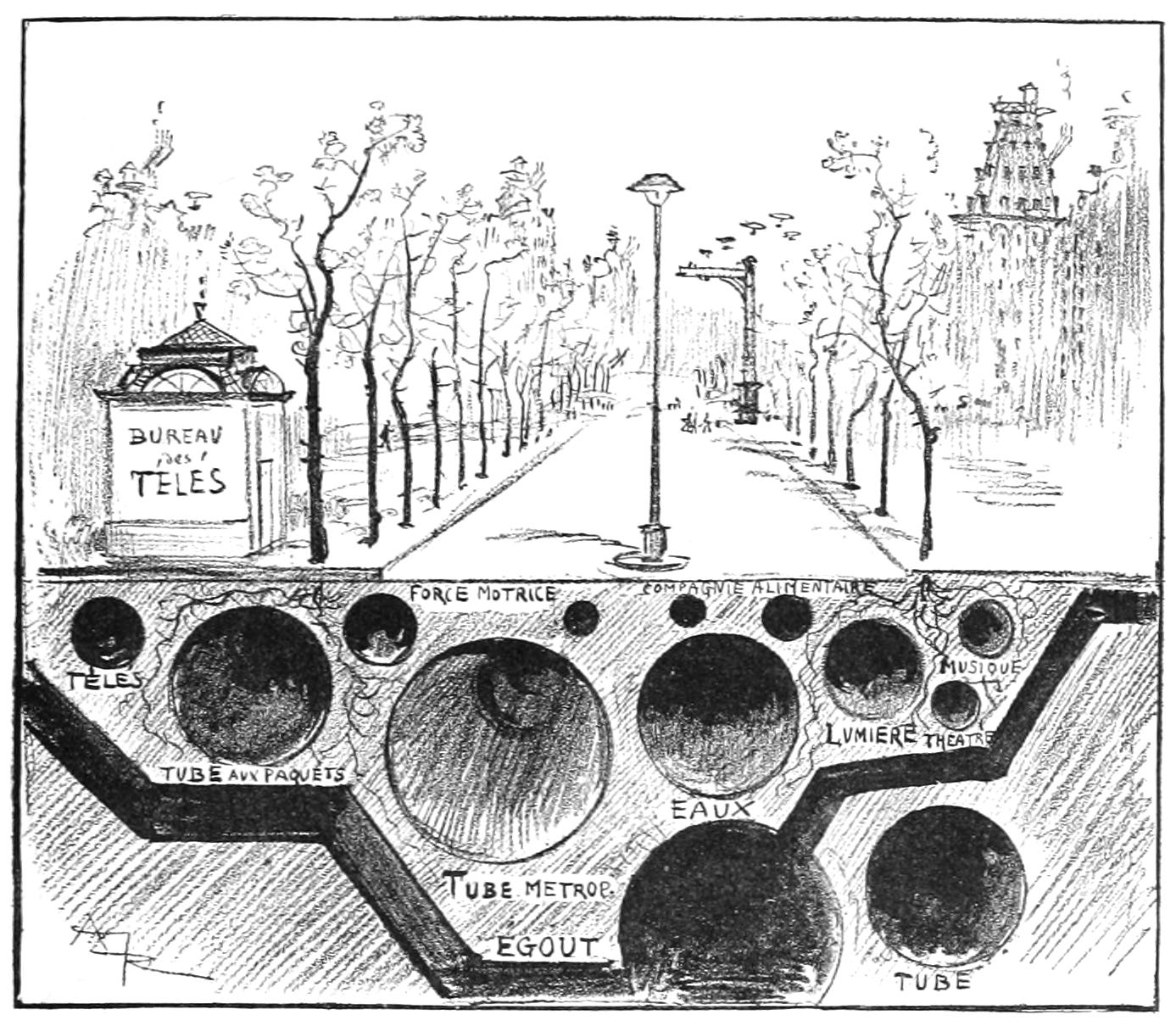
Here are some translations for you guys:
“Tube metrop.” is, I assume, the Métropolitain, i.e. the metro. Note that it didn’t exist yet in Paris — construction began in 1898 — but the London Underground was already several decades old, so not exactly science fiction.
“Egout” is the sewers
“Eaux” is water, i.e. the aqueduct
“Télés” refers to the téléphonoscope, a fictional technology broadly equivalent to TV
“Lumière,” “théâtre” and “musique” seem to be various media being sent over a network — now we know these are all information that is sent over the same cables, but it’s interesting that Albert foresee the need to channel video and audio under the streets. Not sure why they’re distinct from “Télés” though.
Then there are a few more obscure ones. “Force motrice” means “driving force”… Electricity maybe? At the bottom right there’s just a “Tube” and then I have no idea what “Tube aux paquets” ("packet tube”?) could mean.
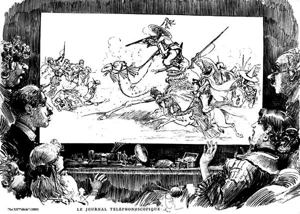
The téléphonoscope is actually one of the most noteworthy inventions in Robida’s work. Wikipedia states that it’s “a flat screen television display that delivered the latest news 24-hours a day, the latest plays, courses, and teleconferences.” So, a mix of cable news, home cinema (seems funny to call movies “plays” but it make sense in retrospect!), MOOCs, and Skype/Facetime/Zoom.
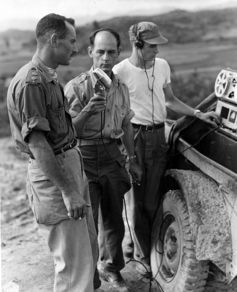
The cable news part would need journalists all over the world risking their lives to bring the latest war news. And sure enough:
For comparison, here is a war correspondent for Radio-Canada in the 1950s, during the Korean war:
While we’re on the topic of war, here’s how Robida envisioned warships, called “floating dungeons”:
How accurate was the prediction? You decide:
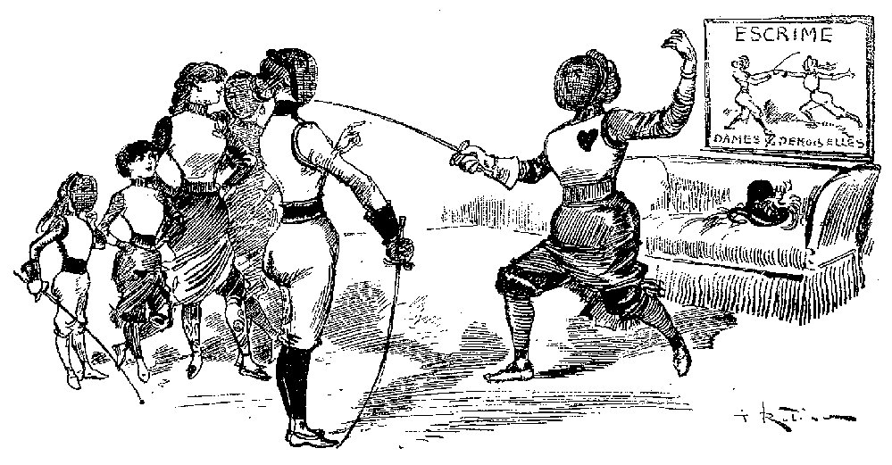
Robida foresaw that women would play larger roles in society, being able to do any job, including in the army. There are pictures to illustrate this, but there are also somehow quite a few pictures of women fencing, so here’s one. (Maybe fencing plays a role in the plot? Yeah, there’s supposed to be a plot. But from what I read it isn’t very interesting, more of a pretext to talk about the future.)
Substack informs me that I’m close to the email size limit, so let’s stop here. You can go here and here to see vastly more drawings from the two books.
But before I conclude, I want to briefly reflect on the aesthetics. I find it fascinating that everything in Robida’s books is distinctively from the 19th century, despite being set more than 50 years into the 20th. He absolutely failed to foresee the evolution of fashion (which changed a lot, in part thanks to Coco Chanel) and architecture (the thin metal railings we see everywhere in the books look nothing like the modernism of the 1950s).
When I think about it, though, it doesn’t seem like a very surprising outcome. Imagining the future of art is probably very hard, on the same level as, well, making (good) groundbreaking art itself. How could anyone in 1890 foresee, say, brutalism? That just wasn’t how buildings were done.
So maybe forecasting the aesthetics is an impossible task. And maybe it isn’t even desirable to perform this task. After all, Robida must have wanted his books to remain recognizable to his audience. You want want to show cool future technologies, but the people using them shouldn’t look alien; they should be people like you and me.
This could explain why these two drawings by him don’t… look very different from each other, despite one representing 1955 and the other, 2000.
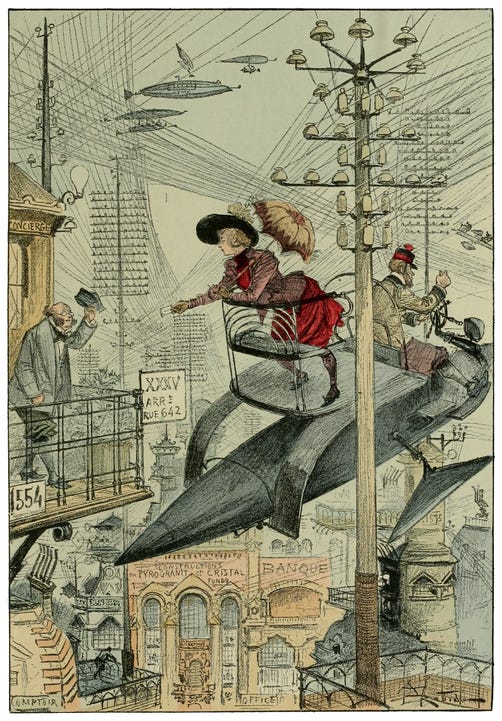
The aircraft is… maybe more sleek in the second one? The fashion might not be exactly the same, but to my 21st century eyes, it’s rather indistinguishable.
There is a cautionary lesson in here: whatever you imagine the future to look like, aesthetically speaking, consider that you’re probably as wrong as Albert Robida was in the 1890s. In fact, I surmise that it’s harder to get the aesthetics right than to get the technology right. After all, the trends of technology are more linear than art and fashion. This sounds a bit paradoxical — new technology is harder to make than new art, so we’d expect it to be harder to predict — but isn’t so surprising if you’re familiar with the pace layering view of civilization.
Technology moves by solving problems, and we know what our problems are: we want better transportation, better communications, better health, and so on. Whereas aesthetics evolve in a much more random fashion, often, actually, aiming at surprising people.
For more, be on the lookout for my post about classical architecture and the future, coming next month! And with that, I now have to take out one image to fit in the email size limit. (You’ll never know which one.)
Étienne


