Learning to read a new language works in levels, each unlocking new capabilities. At a basic level, you can get around by reading the street signs when traveling. At a slightly more advanced level, you can decipher the packaging of an exotic snack you bought. Learn some more and you can find your way on a website without auto-translating everything. But the true sign of mastery, the graal of mastering the written form of a language, is to be able to read entire books. Especially the literary ones.
Each of these levels is an opportunity to talk about cultural comparisons, which is always fun. But because the last level is relatively rarely achieved, we see little discussion of a particular aspect of culture across languages and countries: books, not in terms of their contents, but rather, as physical objects. Typesetting. Cover designs. Marketing ploys. Those are rather specific to the cultures the books come from, and tend to be lost in translation. As a result, outside of publishing specialists and a handful of literary scholars, most of us have very little cross-cultural knowledge in this area.
I’m one of the people who do read literary fiction in two languages, though the two languages in question aren’t particularly unusual. One is my mother tongue, French, and the other is the global lingua franca, English.
This is a common pair of languages to compare, for a lot of historical reasons, as well as the fact that I live in a fairly bilingual city in a bilingual country. I’d be very curious to hear of other comparisons: how do books in Italian, Chinese, Afrikaans or Arabic differ from books in French or English? Also, comparisons that don’t involve English, by far the most common choice of a second language, seem especially interesting. Is there anyone out there who knows the subtle differences between, say, Turkish and Korean publishing?
But all I know is French and English, so that’s what we’re going to compare.
Enter a French-language bookstore, and then an English-language bookstore (fortunately my city has plenty of both), and the atmosphere is totally different.
I have always felt that English-language books seem to be trying really hard to attract my attention. They are often large hardcovers. They have interesting designs, full of color and unique typography. If they have won an award, then they will display that prominently on the cover.
Meanwhile, French-language books tend to be far more sober. Quite often the covers won’t show images of any kind: it’s just the title, the author, and the publisher. When there is art, it’s often either abstract or not directly related to the contents. Monochromatic photographs and historical paintings are common. Bright colors are sometimes used, but the dominant color is usually white.
From afar, a bookshelf can often be recognized as French just because most books are white or pale, plus they often have the same physical dimensions, at least in the case of paperbacks. (Now that I think about it, I believe hardcovers are fairly rare for fiction in French, whereas they’re very common in English.)
In fact, the most prestigious publishers in Paris tend to publish books that look like this:

I would have liked to take a picture of one of my own beige Gallimard NRF books, but it turns out I don’t own any! Nor do I own any books from Grasset, whose novel covers are just plain yellow. Or from the Éditions de Minuit, who publish basic white covers with blue typesetting.
Besides the covers, there are other differences. One that people who own books in multiple languages will easily notice is the orientation of the words on the spine: French books (as well as books in Spanish, Portuguese, and most other continental European languages) have the title and author written bottom to top, while English (and Scandinavian and Dutch) books are top to bottom.
As for the inside of the books, I notice that English fiction tends to be typeset in a very airy way, with lots of space between lines, whereas French fiction tends to be denser. I have no idea why that is.
There are of course further differences between the publishing industries of countries that speak the same language, though they are difficult to distinguish from differences between publishers themselves. I don’t know enough about English-language publishing to notice differences between, say, Canadian, American, and British books. Quite possibly, everything I’ve been saying applies mostly to American books, which I assume are culturally dominant. But I do have some understanding of how books differ between Quebec and France. It’s hazy, though; I’m not sure I can put it in words. One thing that’s for sure is that Quebecois books look more like French books than they look like North American books — an observation that is certainly not true for all aspects of our culture.
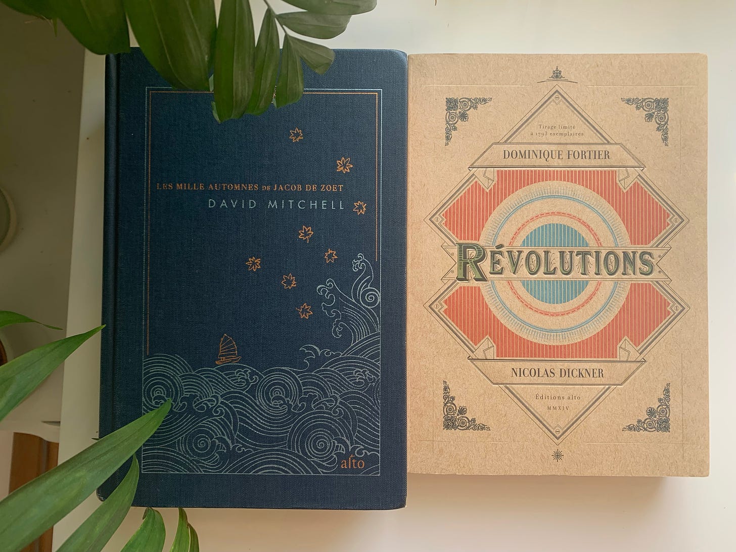
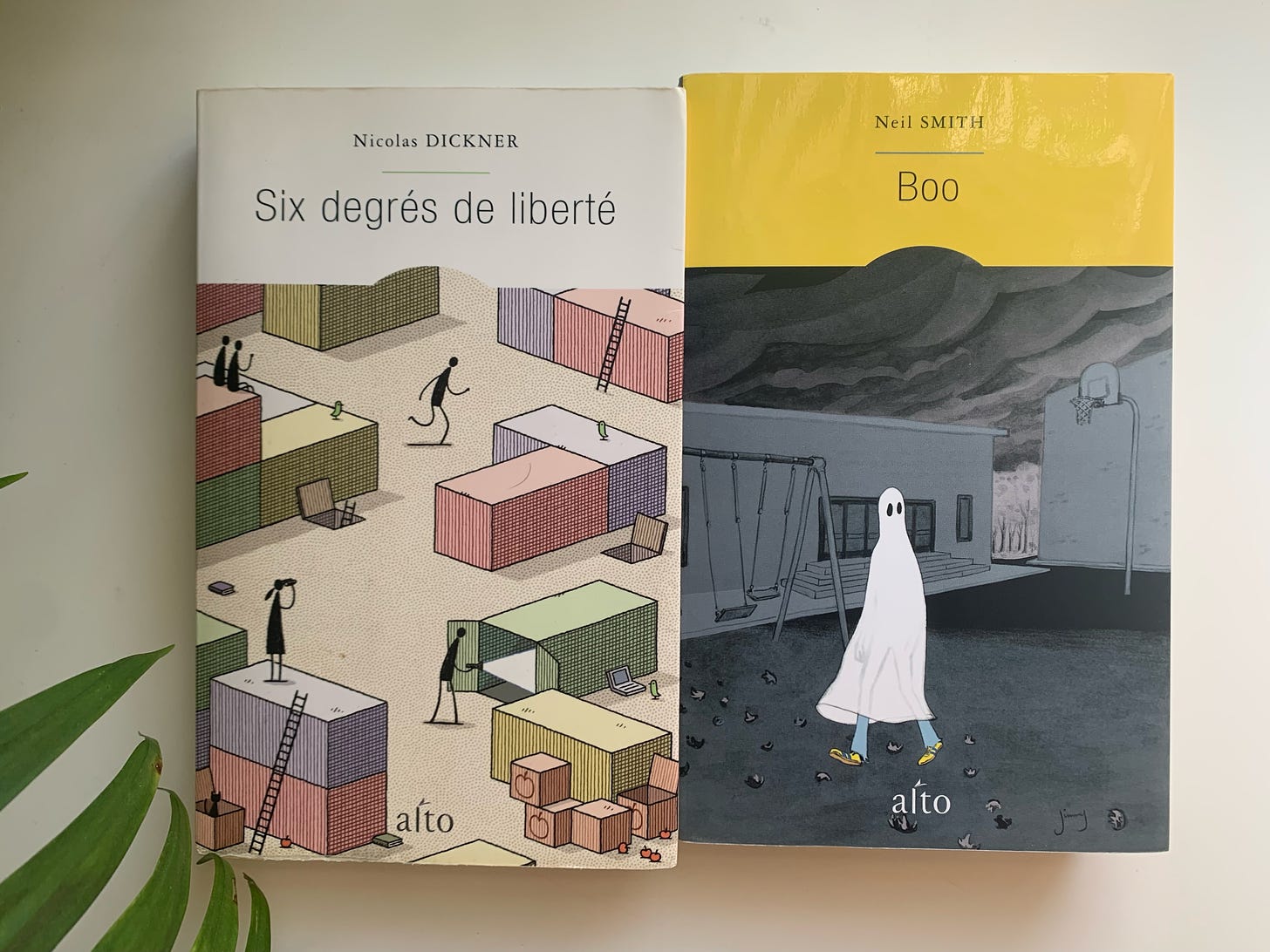
Something I notice about the books here (that feels less true for France, but I may be wrong) is that often, publishers will have a standard, somewhat sober or boring layout for their covers, but then depart from it quite often for special collections. For instance, the publisher Alto, which I like a lot, picks cool art for their books, but usually fits the art into this layout:
But reasonably often, they put in an extra mile to create a particularly memorable design.
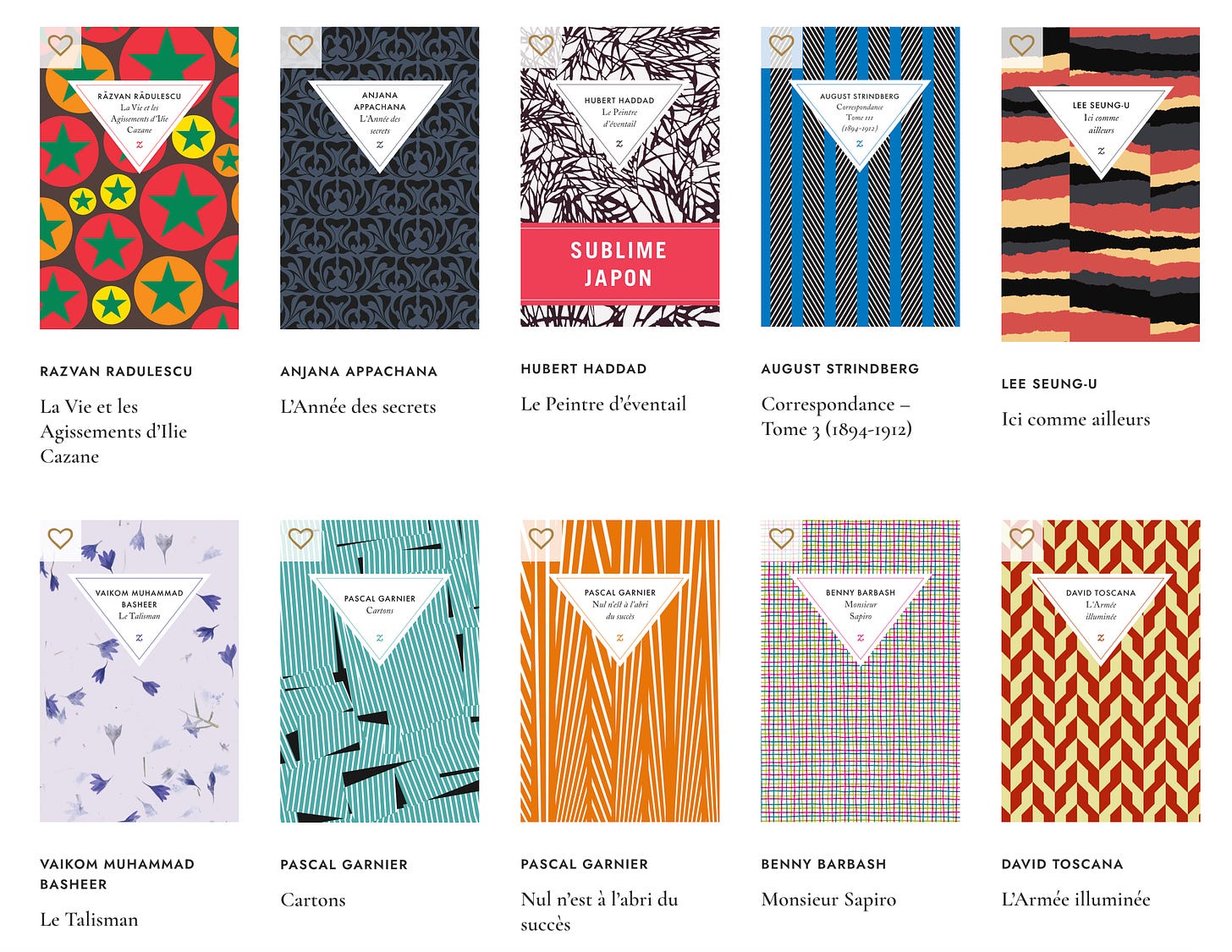
Another example is Le Quartanier, whose regular collection is solid bright colors:

But who also have nice special covers for some books:

Just from looking at my bookshelf, it also seems that Quebecois books tend to be more diverse in their formats, like English-language ones, than French books are. But again I’m not too certain about this.
Now is maybe the right time to emphasize that everything I’m saying here is very anecdotal and based on my personal experience and just going “by the vibes.” Of course, there are tons of small publishers of both languages that do things their own way, too. My observations are also not necessarily representative of many niches within publishing: a genre like science-fiction or mystery differs culturally from literary fiction, and those differences may themselves differ between countries in ways that differ from what I’ve been describing. (That was a lot of “differ” in one sentence. I’m so sorry.)
Maybe a professional publisher can step in and add nuance or explain why the differences exist. In the absence of that, however, we’ll have to make do with my amateur impressions, which I hope are at least somewhat interesting. At least, I’ve rarely read anything like them.
Sometimes I wonder: do I prefer the French or the English book tradition?
Enter a French- or English-language bookstore, as I was saying, and the atmosphere is very different. Often I find myself disliking one or the other. The English books seem too aggressive, messy, consumerist. They won the Pulitzer Prize, or are by a Nobel-Prize winner, and they’re telling you that in gilded letters. Buy me! Buy me! they scream. If they were a website they’d be full of mid-screen popups. The cover designs are individually beautiful, but together they’re cacophonous.
I would take refuge in a French-language bookstore, where the soft off-white tones are calming, where the artwork (when it even exists) is unthreatening. There is color and there is texture, but everything is understated, as if it wouldn’t do to insist too much on the graphic design. This is literature, after all — the written word is king.
But I get bored fast. I find it hard to fall in love with a book whose cover is plain. It doesn’t tell me anything. I can agree that the contents should be king, but even kings dress extravagantly: you have to know who they are at a quick glance! The sobriety of a cover with no artwork, or abstract, muted, understated art, can be pleasant to some degree, but it’s also not much of a signal. In fact sometimes it is a negative signal: if the contents are that good, then why didn’t you pour some energy in dressing it up nicely?
In other words: there are plenty of cases where minimalistic aesthetics are great, but there’s always a risk that they feel like low effort. Many French-language books make it seem like their publisher isn’t even trying to sell any copies.
And so, even though the English-language tradition has aggressive marketing, I think I like it more on average. At least they try!
(I don’t like the extra spacing between lines, though. I don’t know what’s up with that. Do readers like it more? Is it just to inflate the page numbers and sell a bigger book, like a high schooler playing with the font sizes to fill the two pages required for their homework?)
The adage says that you shouldn’t “judge a book from its cover,” but everyone knows that it always happens in practice. The French publishing world seems to have decided to deal with this fact by avoiding nice covers altogether. But that seems a dubious strategy, sustainable only thanks to existing prestige. (Hmm, this is reminiscent of scientific publishing!)
The English publishing world deals with this fact by saying “lol no obviously everyone always judges the covers first,” and although that can lead to annoying arms races, I think that’s the correct take. After all, my own book collection has a lot of books with nice covers, some of which I specifically bought because of that, in both French and English; and almost none of the books with plain covers that prestigious Parisian publishers crank out year after year.
Yes, I judge books by their cover, so does everyone, and if you’re going to publish a book, may I suggest putting some effort into the aesthetics? It would really be a self-own not to.








Addressing the line-spacing question specifically - I think this is a fairly new trend, and I think it's an influence leaking through from web design. At least, when I think about reading books my parents had when I was a child, I remember a lot of them being much closer to the example you showed of French typesetting. It's only more recently that I can remember encountering that more spaced-out style. That said, my light reading is primarily via ebooks these days so maybe I'm drawing conclusions from too few examples.
I honestly don't mind it too much. I find it easier to read text with a little extra room to breathe. Not a ton, I wouldn't personally go above a line-height of 1.4 or so, but 1.2-1.3 is a nice balance IMO.
I would be surprised if it were an attempt to artificially juice some metric like page count. Anecdotally people don't care much about page count - occasionally you'll get people bragging about how they read a thousand-page book or whatever, but it isn't a major factor in my experience. And It must make the books more expensive to print, so I can't imagine that they'd do it if they didn't expect some benefit from it.
I would love to see something like this post but across other countries as well :)
Even though I don't speak Japanese well enough to read its books, there is something about Japanese graphic design which makes me aspire to read it better at some point in my life. Just going into the bookstores and flipping through books and magazines is satisfying... Obviously there is manga but there's also something special about plain non-fiction books in their density and sparseness (somewhat similar to the more classic French books). My favorite though are books with images and descriptions like Japanese math and science books... For instance, take a peek at this Japanese book on Sherlock Holmes (you can see a few pages on Amazon) 😻https://www.amazon.co.jp/dp/4767829771?tag=itmedia-nl-22&linkCode=ogi&th=1&psc=1