Paint With the Colors That Don't Exist
AWM #56: On the non-existence of purple and the preciousness of being conscious 🟣
I.
The accent color I picked for the buttons and links in this newsletter is a purple, specifically #8D58E2 in the hex value model. In the RGB model, this purple has a red value of 141 (out of 255), a green value of 88, and a blue value of 226. So it’s mostly blue, with a healthy dose of red, and some green to make it pale enough.
Here’s the thing: this color doesn’t exist.
II.
The reason we see color is that light waves can have different wavelengths. You’ve seen pictures like this, showing the electromagnetic spectrum from the very tight gamma rays to the long radio waves:
The narrow band between infra-red and ultra-violet is the visible spectrum, i.e. the electromagnetic waves that we can see, also known as light. Zooming in:
Do you see #8D58E2 in there? Nope. It’s not on the spectrum. It’s also not a “paler” version of one of the violet1 wavelengths on the left end of the spectrum. There is absolutely no way for an electromagnetic wave to have that purple color. It doesn’t exist.
But also, it definitely exists. Otherwise you wouldn’t be able to see it. The reason is that it is happening in our heads.
As a matter of fact, the phenomenon of color as a whole is happening in our heads. Physically, colors are really just different frequencies of an electromagnetic wave. But because those frequencies are a useful signal to detect from the environment, humans — or rather, our ancestors — evolved eyes and a brain that are able to distinguish them. “Color” is the name we give to the resulting sensation.
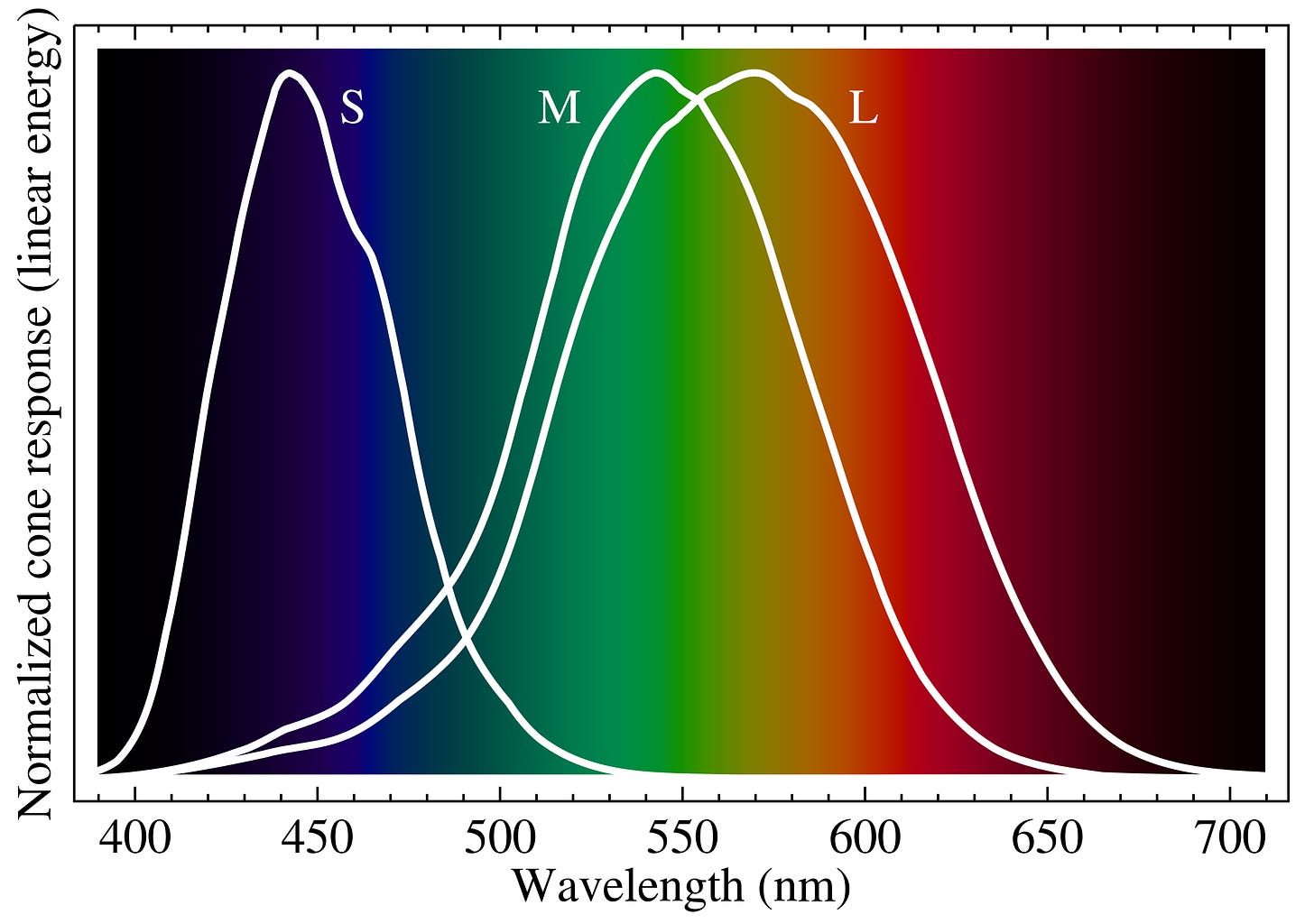
Our visual system, however, is not perfect. It relies on specialized types of neurons in the retina, called cones, which contain pigments that react to specific wavelengths. It would have been too complicated for evolution to give us neurons and pigments to detect every possible wavelength from 380 to 750 nm, so instead, most of us2 have three kinds:
L cones are most sensitive to longer — redder — wavelengths, peaking at 580 nm (yellow).
M cones are sensitive to medium wavelengths, peaking in the green range. They have a big overlap with L cones.
S cones have a totally different sensitivity pattern in the shorter wavelengths, allowing us to see blue and violet.
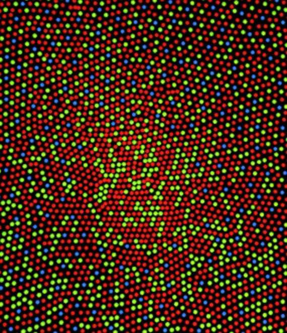
We have a different number of each type. Most of our cone cells are L-type (often represented in red), while only 2% are S-type (often represented in blue). In the center of the retina, there are no S cones at all:
When light enters your eye and hits your retina, it activates the cone cells in different ways depending on its wavelength. If the light is pure 630 nm red, for instance, it will activate the numerous L cones a lot, the M cones a tiny bit, and the S cones3 not at all. All these neurons send the information to the brain, which then interprets the result as “red.”
That’s for pure spectral light with a single wavelength, e.g. from a red laser. In reality, the light that enters our eyes is almost always a mix. Suppose you see an even mix of 630 nm red light and 580 nm yellow light. This will be associated with a specific cone activation pattern that your brain will interpret as “orange.” Now here’s the fun part: that activation pattern would be the exact same if you had received pure orange light.
(From my understanding, the equivalent wouldn’t be the exact average, i.e. 605 nm, but something close to that. Color mixing is not linear. It’s also SUPER COMPLICATED and beyond the comprehension of mere mortals like me.)
All colors can in fact be created in multiple ways. When sunlight falls on a plant leaf, the chlorophyll absorbs certain wavelengths like red and blue for photosynthesis, but is not as good at absorbing green wavelengths, which are reflected back by the cell structures. The specific mixture of reflected wavelengths then enters your eyes and activates your cones to create a “green” sensation. When the same sunlight falls on a totally different green substance, like an emerald, it may be absorbed and reflect wavelengths in a different way, but end up activating your cones in the same manner, therefore appearing to be the same green.
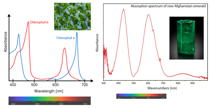
So if you can see the color #8D58E2, it’s because the cones in your eyes are processing some mix of wavelengths that your brain interprets as purple. There are a number of combinations that can give this color — but none of them is a single, monochromatic wavelength. This is because the mix is activating both the L and the S cones, which cannot happen with a single wavelength.
Almost all shades of purple are like this. They are almost all a mix of red and blue — wavelengths that are not at all close to each other on the spectrum. The only exceptions are the few shades of violet on the high-frequency end of visible light.
To visualize this, look at the CIE 1931 color space chromaticity diagram, an insanely confusing chart (I repeat, color is REALLY COMPLICATED) that shows all the colors visible to average humans.
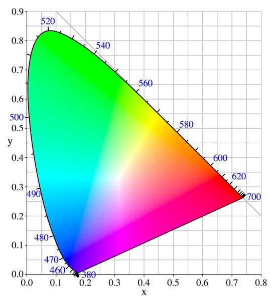
The monochromatic spectral colors are on the horseshoe curve, with their nanometer wavelengths shown in blue. All the colors inside the curve are mixtures. As you can see, purples, pinks, magentas and so on are inside, in the bottom region, on what is called the “line of purples.”
All these colors exist only in your head.
III.
But also: The “pure” colors that you can see on the horseshoe curve of the CIE 1931 diagram above, and the “pure” colors on the spectrum diagrams I showed you earlier, are in fact mixtures of wavelengths. They’re nowhere near pure.
Why? Because you’re reading this on a screen. (Well, unless you have… printed it? In which case the actual colors you see depend on the ink.) Computer, TV, and phone screens are almost all made using the RGB model: They are composed of pixels, each in turn made of three subpixels. The subpixels emit light in three ranges of wavelengths centered on the red, green, and blue regions respectively, and can be lit with varying intensities, creating mixtures. One such mixture is RGB 141, 88, 226, which is the formula for our friend #8D58E2.

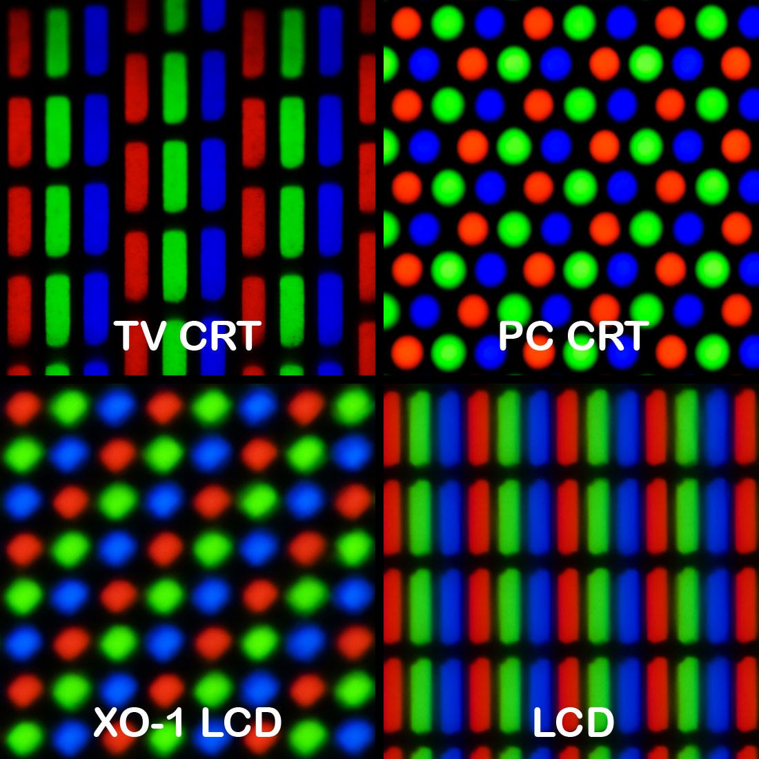
Since screens can only emit red, green and blue mixtures, as well as mixtures of those mixtures, they cannot emit true monochromatic light. For example, it is literally impossible for me to show you an accurate picture of spectral violet light in this newsletter. You can only get approximations made of blue and red. Purple.
Most of the web, and most screens, use a standard RGB model called sRGB. This model limits the total number of colors that you can see. On the chromaticity diagram, it looks like this:
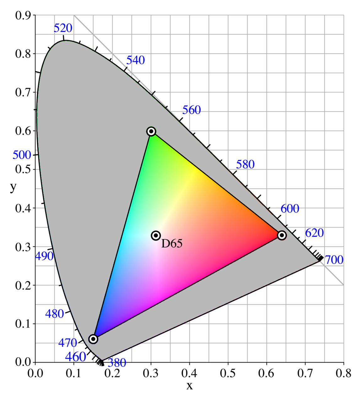
Everything shown in gray, outside the triangle, is impossible to see accurately on an sRGB screen. This means that in the version of the diagram shown in the last section, most of the colors — including anything close to the horseshoe curve, i.e. the spectral colors — are incorrectly rendered.
Some screens are built to have a wider gamut, i.e. a larger triangle of possible colors. For instance, my MacBook Pro 2020 uses the larger DCI-P3 color space. But as far as I know, none covers the entire diagram. The ProPhoto color space developed by Kodak comes close, with 90% of the area.
This limitation means that when you take a photo of some very bright color, the result on your screen might look comparatively dull. The printed version of the photo too, depending on what printing process you use.
In other words, reality is more colorful than a TV or computer display. Within a screen, there is a wealth of colors that simply don’t exist.
IV.
We’re only scratching the surface of the full complexity of color. There are several other ways in which colors don’t exist.
One of them is chimerical colors. These occur when you “trick” your visual system by looking at something long enough that your cone cells become fatigued, and then looking at something of a different color.
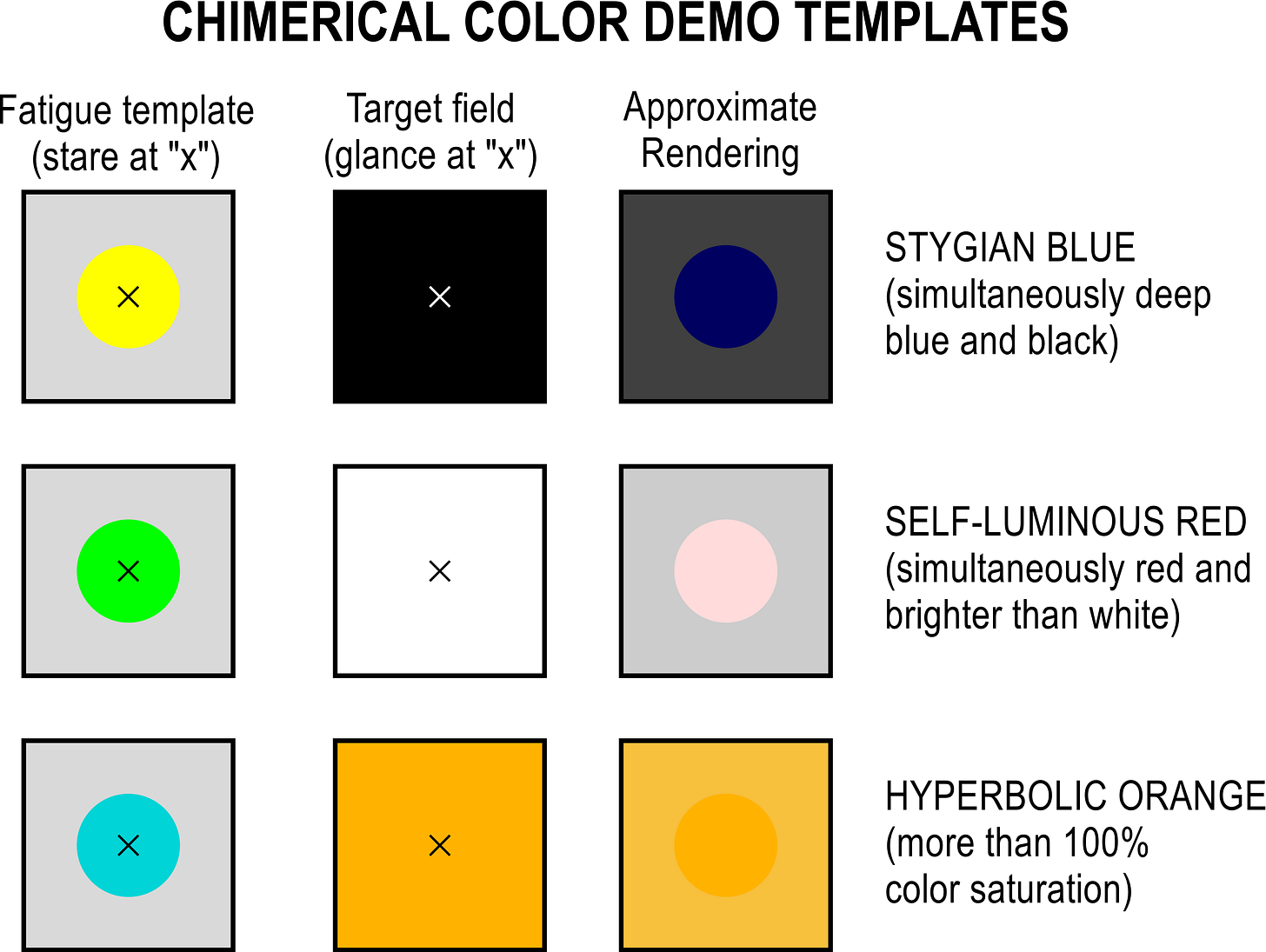

How does this work? When you stare at the blue circle in the last image, your S cone cells become used to seeing blue, so they compensate by losing sensitivity to it. Your L and M cones, meanwhile, are less affected. When you move your gaze to the black box, your S cones are still compensating, so you see “less” blue than you should, even though there is already zero blue. Since your L and M cones are more activated than the S ones, you see yellow that is as dark as black, which shouldn’t happen since black is already as dark as it gets.
This is closely related, as you may have guessed, to the concept of complementary colors.
There are multiple definitions of what complementary colors mean in art, colorimetry, and human biology. (Have I mentioned that color is INSANELY COMPLICATED?) The biological one, as far as I understand it, is related to how the retina processes the information from the L, M and S cones. The retina doesn’t send the raw activation data from the three cone types, but instead creates three signals: a red vs. green signal (how much the L and M cones are activated compared to each other), a blue vs. yellow signal (how much S is activated compared to L + M), and a general intensity signal (based on L and M cones, I think).
Complementary colors are colors that are on opposite ends of this 3D space because of the way your retina works. You can’t see a “bluish yellow” or “reddish green” — not because you can’t mix those wavelengths (you totally can) but because there is no way for your retina to send such a signal to the brain.
Or can you? Some researchers have claimed that these colors can be seen under certain circumstances. Try it for yourself by crossing your eyes to superimpose the white plus symbols in these two diagrams:
Do you see an impossible color? It might be hard to tell: the idea seems to be controversial. It doesn’t help that studying color perception is directly related to difficult questions around consciousness that quickly gets us to tough philosophical questions (“do I see the same blue as you do?”). But if true, it would be yet another way for colors that don’t exist to, well, exist.
Lastly, I want to mention phosphenes, the remanent patterns that are “imprinted” on your retina after you’ve glanced at a bright light. These patterns often have indescribable colors and, according to this Reddit post, “are said to be the inspiration for Terry Pratchett's fictional ‘octarine’ color, which he describes as a ‘greenish yellow-purple’.” But let’s not get into the vast world of imaginary colors born from the mind of fiction writers — we would be here all day.
V.
Color is perhaps the most ordinary part of the human experience that is this complicated to understand. This is why I have long wanted to write a post on color theory.
Now it’s done — but I would like this post to go beyond mere description. I would like there to be a broader lesson.
Perhaps the lesson is this: Reality has a surprising amount of detail. Everything is always more complex than it seems. Color, which is such an obvious part of reality that it’s one of the first things we learn in childhood, is in fact a clusterfuck whose complete understanding requires mastery of electromagnetic physics, linear algebra, human eye physiology, neuroscience, and monitor display technology.
This observation has an interesting implication. A few weeks ago, I wrote about the metaverse, this possible merging of various online experiences into an integrated virtual universe. I’m not very fond of the concept, for reasons that should be clear from that other post, but now I have another reason: the metaverse will almost certainly not cover the full chromaticity diagram!
Virtual reality will probably always be less bright and colorful than physical reality, unless we become much better at virtual physics than we currently are. Can you imagine spending all your waking hours in a place that limits what your eyes and brain are capable of?
(Of course, we already mostly do. But this is not a good thing.)
Simulating a thing, anything, removes a lot of its complexity. It’s unavoidable. Our brains are also simulation machines, building models of the world that are vastly simpler than the world itself. The compression our eyes perform on all visible wavelengths, turning them into only three retinal signals, is a great example of that.
Still, it seems worthwhile to make the most of reality, where complex physics is given to us for free. If we spend too much time in simulations, then we lose some of the wealth of existing.
At the same time as our brains simplify the world to make sense of it, they add beautiful complexity to it. Light, in the non-biological realm, is only waves, some with higher frequency than others. With no living beings to detect, integrate, and interpret them, a mixture of electromagnetic waves is just that: a bunch of waves. But when there are living, conscious beings around, they become a million new sensations, from purple to pink to hyperbolic orange.
So perhaps the lesson is this: Consciousness is a precious thing. It literally adds color to the world. By existing, you, I, and every human and animal4 alive, are painting the universe with colors that would not, otherwise, exist.
Yeah. Let’s make the most of it.
“Purple” and “violet” are two different words that refer to very related colors, and their usage varies. In this post I’m going with the “logical” usage of referring to the colors beyond blue on the spectrum as “violet,” and the non-spectral colors that mix blue and red light as “purple,” but it’s not the only correct way to use those terms.
“Most of us” because colorblind people lack one or more types. There are also rare cases of people having a fourth type, a condition known as tetrachromacy. It gives you the superpower of distinguishing colors with greater precision.
Other animals also have different numbers of cone types. Whales have only one, so they don’t perceive color differences. Dogs have two, centered on the blue and green parts of the spectrum: they can’t perceive red and orange. The mantis shrimp famously has up to 16 types of photoreceptors.
Hard not to read this as “Scones”
At least, every animal with eyes and at least two cone types. Thanks for existing, mantis shrimp!


