The future, most people would agree, is inherently unpredictable. Yet not all of it is: depending on the time scale of your prediction, some aspects of the future won’t change very much. The sun will still be rising in 100 years, for instance. The eventual fate of the sun, in several million years, is also quite predictable, because stars turn out not to be that complex: they’re mostly just big balls of plasma undergoing constant nuclear fusion.
The sun, and many other phenomena, belong to the lowest rung of the pace layering model of change: nature. Nature moves very slowly, so you can usually predict no change and you’ll be about right.
As we move up the ladder, things become less predictable. For instance, unexpected discoveries in science can change our culture, governance, or infrastructure layers quite a lot. Physics was once thought to be almost solved; late 19th century scientists expected all future improvement to be incremental. And then Planck, Einstein and others changed physics completely, and a hundred years later we have nuclear-powered energy infrastructure and a world order partially based on weapons of mass destruction, among other completely unforeseen developments.
Still, technology isn’t that hard to predict. If something is in principle allowed by the laws of physics, then a prediction that it will be invented someday is likely to be true, given enough time. People have known forever that human flight was a theoretical possibility; it was a staple of science fiction at least since Greek myth. It took centuries, and there were many skeptics, but heavier-than-air flight did eventually come to pass. So will many technologies that feel futuristic today.
Thus the future isn’t wholly unpredictable. But there is a part of it that is utterly impossible to forecast. I am referring to that wiggly, chaotic line in the top layer: fashion, also known as aesthetics.
The future is aesthetically unpredictable, but we still want to depict it — to tell cool stories, and to have visions to dream about.1 So how do we do that?
Most people today have a linear conception of time. The past seems to be constantly receding, while the future is getting closer: they are opposites on the temporal dimension. So if you want to imagine future aesthetics, you will intuitively try to steer away from past aesthetics. Unless you’re trying to make a point about the cyclical nature of time — or predicting a return to some historical trend, such as feudalism in the galactic civilization of Dune — the natural impulse is to put as much distance as possible between your imagined future and the actual past.
In practice, that tends to create visions such as this one:
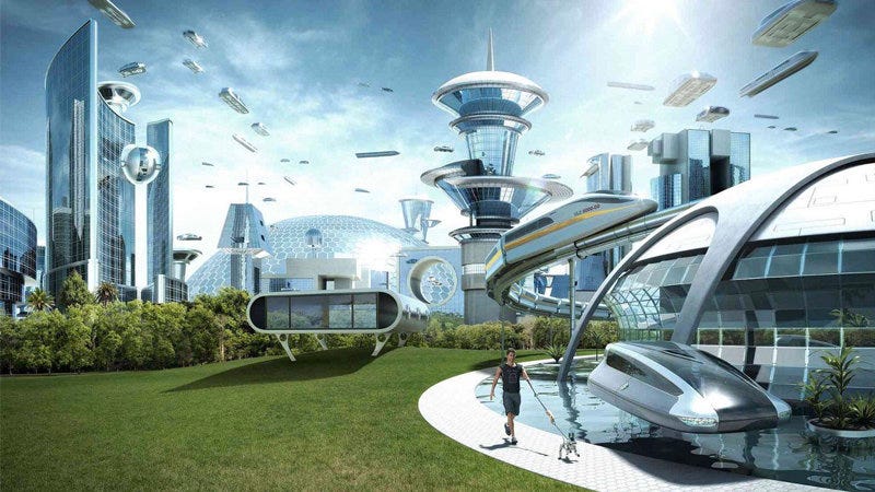
I think about this image a lot. It might be one of the most boring visions of the future in wide circulation. Sure, it doesn’t look hellish. It’s clean, sunny, evidently wealthy. But it’s also unexciting, colorless, cold, and lonely. Why do we imagine the future like this? Because it successfully avoids most references to the past.
It doesn’t fully avoid references to the past, of course. For example, that train in the middle looks like existing trains, which were designed earlier than the image was. It would in fact be impossible to create a work of art that referenced nothing from the past, unless perhaps you made some sort of abstract pattern that looked like nothing recognizable.
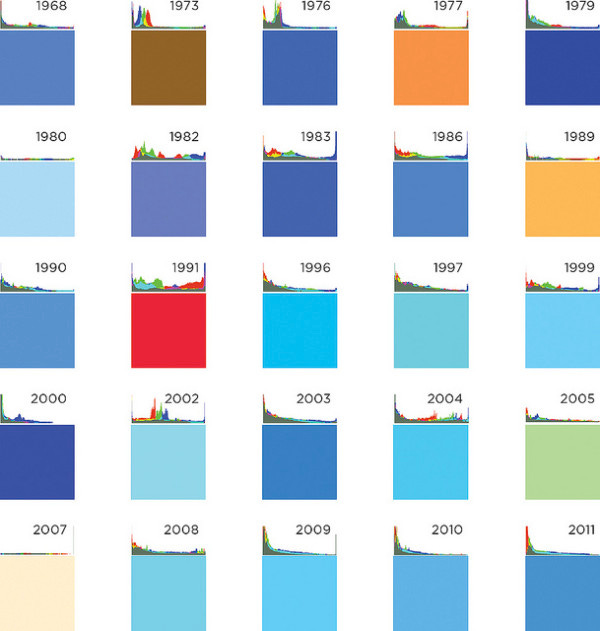
Yet even if the “The World If” image can’t avoid the past altogether, it gets close. Part of the reason is that it depicts elements that are still in fashion today. Glass and metal skyscrapers are prevalent in contemporary architecture, so they don’t evoke the past too much. The color blue has rarely been used historically, because it is rare in nature beyond the sky and sea, and it was an uncommon pigment for painting and decoration — so your sci fi vision will look more futuristic if everything is blue.
In fact, you could say that the “The World If” image manages to look futuristic not by predicting any new aesthetics, but by depicting the world of today minus anything that evokes the past. Just add a few plausible future technologies, like hovercrafts or robot dogs, and you’re done. We can even write out the equation:
Futuristic aesthetics = Today - Past + Futuristic tech
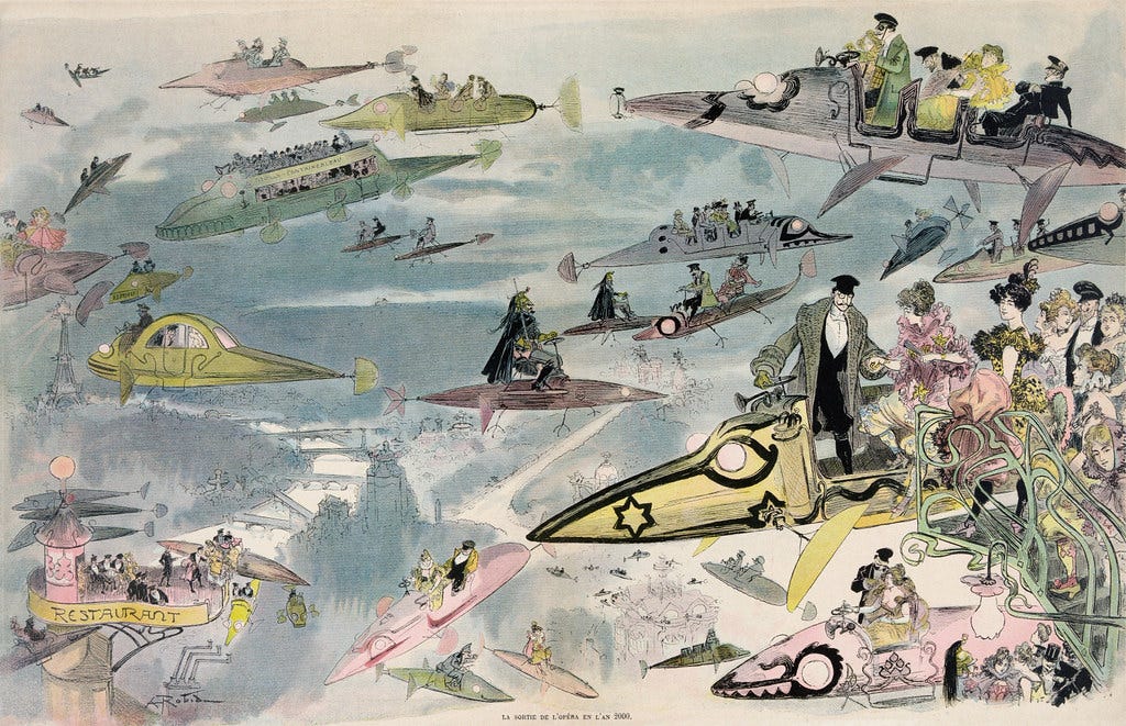
This equation is not new. A century ago, would-be visionaries did the exact same thing. The following image by Albert Robida was painted around 1902, and meant to depict people leaving the opera in Paris in the year 2000:
Like most visions of the future from a long time ago, the aesthetic predictions look hilariously wrong. But they would not have been out of place at the turn of the 20th century. Compare the fashion of the men and women above to those in the real poster for an opera event, below, from 1900:
Meanwhile, there’s nothing obviously old in Albert Robida’s vision of the year 2000. Everything was brand new for the 1900s. The green handrail at the right was a staple of the then-fashionable Art Nouveau style. The Eiffel Tower, visible in the background at the left, was barely more than a decade old at the time, and probably still felt very futuristic.
So Leaving the Opera in the Year 2000 follows the same equation as the “The World If” meme: the aesthetics of the present, minus any references to the past, plus some futuristic tech (various incarnations of flying vehicles). As it turns out, the tech predictions aren’t that wrong: we don’t have the exact same flying contraptions, but we do have helicopters and private jets. Moreover, Robida’s other work includes many examples of technological and social predictions that did come true — from electrical grids to women’s fencing to cable news and war correspondents.
But as an aesthetic prediction, the painting is very much off the mark. And although it looks pretty cool to us more than a century later, it was probably nothing very special, aesthetically, to the people of 1902.
What if we removed the middle term of the equation? What if we didn’t try to purge our visions from elements of the past? Then we get retrofuturism.
Retrofuturism is all about deliberately using the past to depict the future. It can take many forms. A popular one is steampunk, which imagines modern or future technology as if it had been developed during the Age of Steam.
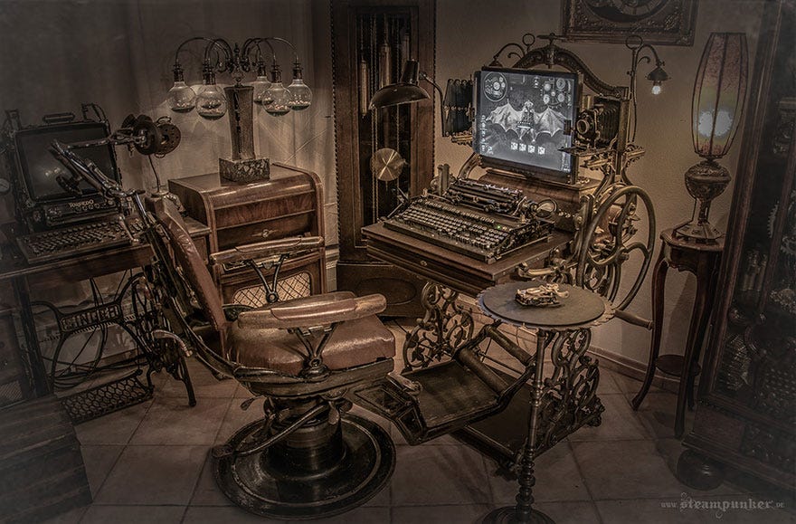
After the emergence of steampunk, a wealth of other retrofuturistic aesthetics with ‑punk suffixes have been identified, including cyberpunk (which incorporates aesthetics from the high-tech late 20th century), dieselpunk or atompunk (inspired from the 1940-50s), and solarpunk (which isn’t that obviously retro, but often incorporates Art Nouveau elements and points to a time when nature played a larger role in our lives).
But these are only a small subset of everything that’s possible. The past was home to a virtually infinite number of aesthetics, and any of them can and do serve as inspiration for retrofuturistic visions. You could invent a future that incorporates medieval European elements. Or traditional Chinese ones. Or ancient Egyptian ones:

At another blog I contribute to, The Classical Futurist, our goal is to use insights from classical antiquity to understand the present and future. One of the interesting dimensions to look at is aesthetics: classical architecture, for instance, has been revived many times in history. Each time that an architect built something new while using Greco-Roman elements (such as columns), they were being retrofuturistic.
Closer to us, an artistic movement like vaporwave is also a clear retrofuturistic aesthetic, mixing classical art with 1980s and 90s computer nostalgia.

Vaporwave is a great example of combining different kinds of retro into something new. And this turns out to be a crucial element of why retrofuturism is interesting. It’s never mere nostalgia. It’s always a remix.
Indeed, it’s worth repeating the common lesson that everything, in art, is a remix. The only exceptions are pure copies of existing art, and the completely original (and uninteresting) abstract patterns I mentioned earlier, neither of which are likely to be called “art.” Even this post is a remix! I’ve been worrying all day that I was just rewriting my post on classical architecture, my post on Albert Robida, or my post on predictions. But I’m reusing them — and many other influences besides — to write something that goes farther in some direction than any of them.
Trying not to remix creates boring art. The reason is that you’ll remix things anyway, but you won’t be intentional about it. So you’ll just use whatever is most immediate to your mind: clichés and scenes from your daily life. And so we get the equation again: your vision of the future is the present (because that’s what you’re familiar with) minus the past (because you are not remixing!), plus some cliché futuristic tech, like flying cars.
It’s much better to lean into the retro. Use the past; use several pasts at once. Remix them into something new, and suddenly your vision of the future will come alive.
For some reason, retrofuturism sometimes gets… not quite a bad reputation, but let’s say that it generates disappointment. Among the people who are excited about the future — sci fi enthusiasts, techno-optimists, etc. — retrofuturism can be seen as a sign that we’re bad at imagining the world of tomorrow. As if the best we could do was to reuse the images and stories of yesterday.2
As an example, consider this tweet by Andy Matuschak (which inspired my tweeted response and, now, the essay you’re reading):


Indeed, “what would a now-rooted, forward-facing, hopepunk aesthetic look like?” The answer is that there is literally no way to tell. Future aesthetics are unpredictable.
Andy meant well with this question — and it is an interesting question — but he’s making the same mistake that leads to bland “The World If” visions. Future aesthetics will necessarily be retro in some way. Which kind(s) of retro? That will depend on what our artists and storytellers come up with.
They’re lucky to be able to draw from the rich tapestry of human culture, from ancient Egypt and Greece to 1990s cyberpunk and everything in between. They’ll come up with something inspiring, I’m sure.
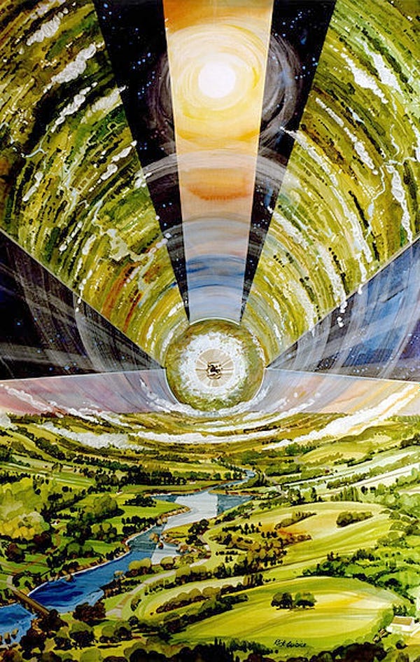
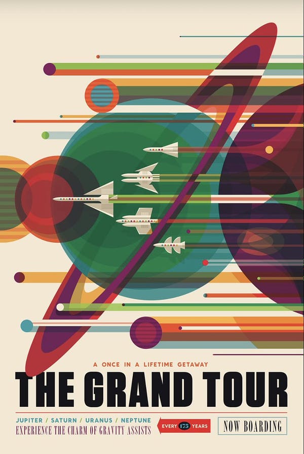
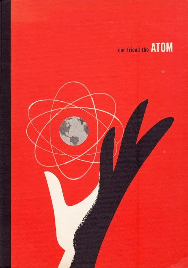
NASA understood this well. Two of the examples cited in Andy’s tweet are posters from their Visions of the Future series, which repurpose the style of vintage tourist ads to imagine what it would be like to visit other moons and planets. I cannot emphasize enough how original and inherently futuristic these posters are. They are well-made remixes of (several!) old styles with forward-facing ideas. They’re awesome; I even once printed two of them to hang in my apartment.

That’s what retrofuturism is: futurism done well.
Sometimes we also want to depict undesirable futures, for example in dystopian fiction. But this post is about aesthetics that seek to inspire.
Worse, it could be seen as admitting that anti-progress people are right, and that we should return to some idealized past. These people — the modern-day Savonarolas and Spartans — would lead us to stagnation and pain, and they’ll use traditional aesthetics to attempt to convince us. The answer to this shouldn’t be to give them a monopoly on past aesthetics, but it too often is.




Another reason retrofuturism is a valuable / useful idea goes back to your "pace layering" diagram. Fashions definitely change but would we really want our underlying culture to change as quickly? Retrofuturism, in effect, is saying that although the fashions of the future will be wildly different, there will still be an underlayer of familiarity - people will still go on vacations to exotic locales, only this time it will be to Enceladus instead of Miami.
Great article! Love this alternative view vs the boring/bland future stuff we see all the time.