Over the last few days, I got to visit someone in the geriatric psychiatry unit of a Canadian hospital. To the surprise of absolutely nobody ever, it turns out that a geriatric psychiatry unit is not a happy place.
The main reason is, of course, that it is full of frail, old patients who are struggling with severe depression and other tragic maladies. But this is the whole point of the geriatric psychiatry unit, so let us remove the patients from the portrait for a moment. What do we see? Vinyl floors, blandly painted walls. Basic furniture, two beds per room, separated by an ugly curtain. Faded out art reproductions hanging here and there. Sheets taped on the walls elsewhere, with breathing exercises and inspirational messages. A conspicuous lack of live plants. Bright fluorescent lighting. Bathrooms that could belong in a prison. A lounge with a couple of couches, a few games, and a computer that is running some probably outdated version of Microsoft Windows. If you want to take a walk outside, a few tables by the curb side, with a dazzling view of multistoried parking lots.
It’s not all bad. There’s quiet, pleasant music in the corridor. A big board displays the colouring exercises that the patients occasionally do to pass the time — a mosaic of rainbow-coloured bouquets and mona lisas. And the staff are around, as helpful and nice as they can.
That’s what the geriatric psychiatry unit does: whatever it can. It has limited resources. It has constraints, like preventing the patients from accessing anything they could harm themselves with. Anything out of metal is a no-go, so cheap plastic reigns supreme. Add the fact that mentally ill patients sadly don’t make the best company, and it’s understandable that no one wants to hang out in the geriatric psychiatry unit for too long, unless they’re being paid to do so.
Yet one cannot help but wonder — could we design such places better? Perhaps much better?
After all, it feels plausible, if not obvious, that healing from mental problems would be easier in comfortable, wholesome, beautiful places, rather than a dreary hybrid between a sterile government office and a youth detention centre. And if we’re not doing everything we can to cure patients, what are we even doing here in a geriatric psychiatry unit?1
‘Why are hospitals ugly?’ is an instance of the more general question of why contemporary architecture is so often seen as bad, especially institutional architecture.
One type of institution I often ask this question about is airports, which I’ll someday write a blog post about. A possible answer is that the idea of an airport is only roughly 100 years old. Unlike, say, train stations, airports have only been built during the globalized era, which removes the benefit of multiple cultures developing their own architectural styles independently. Instead everyone just copies each other. It’s safer to implement the “best practices” from some other airport rather than radically rethink what an airport should be like, and therefore all airports end up with the same “Apple Store” look.
I think that argument makes sense, but I’m putting it out there to highlight how it very much doesn’t apply to hospitals.
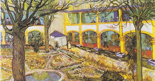
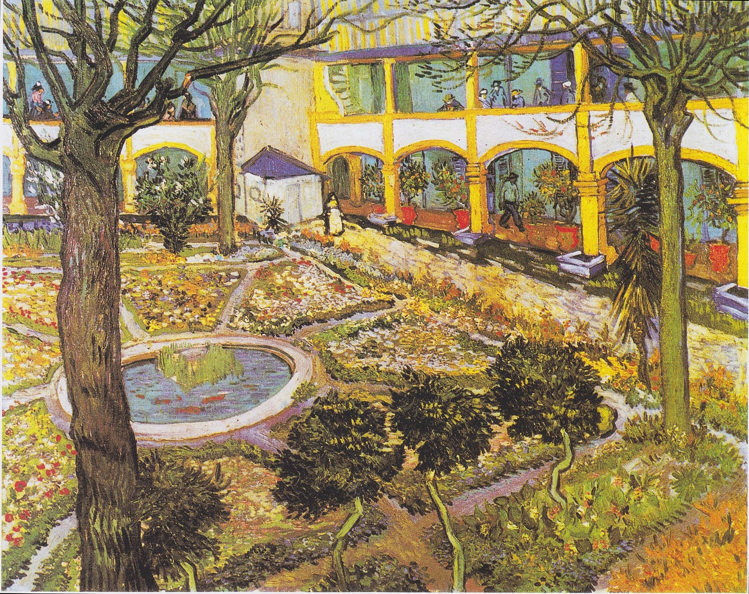
The cover image for this post is a painting by Vincent van Gogh, representing the garden at one of the hospitals where he spent much of the last years of his life due to psychosis and depression. Today it looks like this:
This was the Hôtel-Dieu in Arles, southern France. It dates from the 16th or 17th centuries. Today it isn’t a hospital anymore: it has been converted to a museum about van Gogh. The main hospital in Arles now is this:

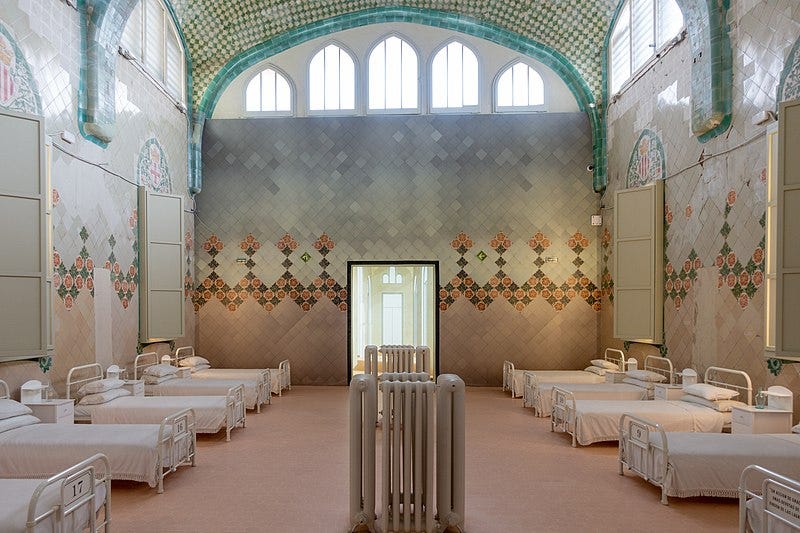
Also in the Mediterranean area, but much more recent — built between 1901 and 1930 — we have what is perhaps the most beautiful hospital I know of, the Hospital de Sant Pau in Barcelona:
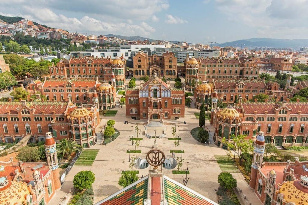
Maybe it’s just me, but I almost want to fall sick in Barcelona just to go there. Except that I can’t, of course. Although the hospital has been open until the 2000s and a few pavilions are still used for medical purposes, it has mostly been converted to an office park and tourist attraction, and the facility has almost entirely been relocated into a new building nearby. Behold:

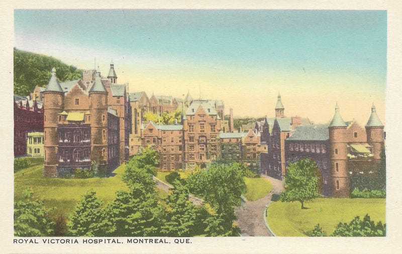
In my own city of Montreal, compare the old Royal Victoria Hospital, built in the late 19th century:
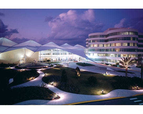
To what is has been replaced with:

I’m sure all these modern hospitals are fine. For all I know, they’re probably much better places to work or stay in, simply because they’re up-to-date. Old hospitals have a tendency to, well, be old. There’s a reason we always end up replacing them with modern installations.
But am I wrong in thinking that they’re also major aesthetic downgrades?
And that unlike airports, that can’t be attributed to a lack of imagination — since clearly we have plenty of beautiful specimens to get inspired from?
The puzzle of modern and contemporary architecture in general has literally dozens of plausible answers, which is another way to say we have no idea what the solution is. The hospital-specific version is similarly intractable.
We can take guesses anyway. In many countries, hospitals are publicly funded, and so may be victims of the same trend that makes government offices dreadful: the authorities don’t want to be seen as squandering money. Any funds you spend on fancy architecture could have been spent on some new machine to cure cancer patients, or hire another surgeon, or lowering taxes, or something.
But this can’t be the full picture, since privately funded hospitals also exist. As a resident of a place with socialized healthcare, I’ve never been to one, but I assume they probably look a bit better on average. Yet after reading several “Most Beautiful Hospitals in the World” lists online (e.g. here or here; check out the footnote for a sample2), I didn’t see anything approaching the Hospital de Sant Pau, so it doesn’t seem that there are any striking differences. Also, airports are generally privately-run, so the explanation can’t apply to them. Maybe what matters is that hospitals and airports, whether public or private, are “high-stakes”: they’re expensive and important, so builders prefer to stick to safe designs.
Or maybe hospitals are always just too young. The other day I encountered the intriguing idea that buildings have to “cook” for about 200 years before they truly blend into their environment. But hospitals seem to have a lifespan of about 100 years before they’re considered obsolete and moved to a modern facility. So by default, the only beautiful hospitals are the ex-hospitals.
Maybe hospitals always “catch” the ugliness of what they contain. Disease, frailty, insanity and death aren’t beautiful, and no matter how aesthetically pleasant you try to make the building, it will end up having negative connotations. Again, only ex-hospitals are released from this.
Maybe beauty doesn’t matter anyway for almost all patients, except for a few depressed people in the psychiatry department, and it’s just an unfortunate side-effect of bundling all medical activities together that the depressed people have to try to get better in bland bedrooms with plastic beds and fluorescent lighting and parking lot views.
Or maybe, just maybe, this is just one of things our civilization is not good at yet. Someday, when we’re far wealthier maybe, we’ll design the most beautiful, cozy, solarpunk hospitals, surrounded by peaceful gardens and inspiring art as far as the eye can see. And when we’ll look back at the hospitals of the early 21st century, we’ll shudder at the idea that we used to confine our sick people to such bleak, sad places.
As far as I can tell, the serious answer to this rhetorical question is, prevent them from committing suicide, which probably explains some of the prison-like aspects. Still, there’s no particular reason that we can’t design beautiful prisons.
A selection of supposedly the most beautiful hospitals in the world:









The aesthetics of modern architecture is probably my biggest gripe. Because it’s not just hospitals, it’s all buildings. They used to be beautiful because they were made with stone and brick. But then we invented less expensive ways to build and now everything is ugly. 😭😭😭To your point, there is probably still a way to make modern materials look pretty, even solarpunk, but for some reason we don’t. It’s so devestating!
Hospitals should be beautiful. This can and would save lives. What you need when you are seeing your dying loved ones is beauty and inspiration. It is a sad fact that hospitals are so ugly and hideous, with a few notable exceptions. This post is a glimmer of hope.