Travel Notes From the Most Beautiful Hospital in the World
L’Hospital de la Santa Creu i Sant Pau in Barcelona 🍊

Sometimes you write a blog post called “Can Our Civilization Build Beautiful Hospitals?”, in which you briefly mention the most beautiful ex-hospital you know of, in Barcelona; and soon after, with no premeditation of any kind, almost by chance, you find yourself in Barcelona, walking past the gates of that most beautiful ex-hospital, which has been converted to a tourist attraction after closing in 2009. You don’t realize it yet, but seven weeks later you’ll be able to squeeze a new blog post out of it. Such is life.
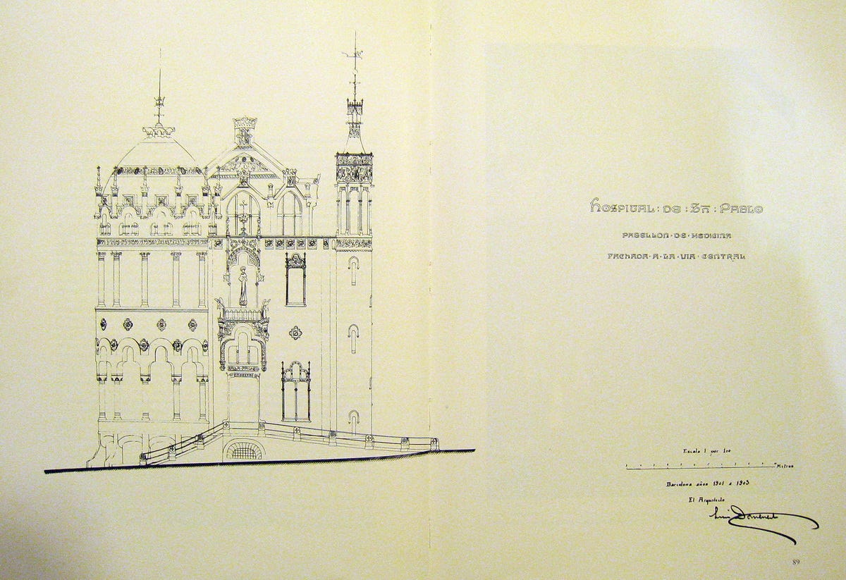
The Hospital de la Santa Creu i Sant Pau (Catalan for “Hospital of the Holy Cross and Saint Paul”; I’ll shorten it to just “Sant Pau”) was built between 1901 and 1930 in the Eixample neighborhood of Barcelona. The architect was Lluís Domènech i Montaner. The style is Catalan modernisme, not to be confused with anything else named modernism: modernisme is a local flavor of Art Nouveau. Indeed it is about as far from modern architecture in the usual sense as you can get.

Catalan modernisme is quite the vibe. It is sort of neo-Gothic, a bit neo-Moorish, but also definitely not medieval. Like the other branches of Art Nouveau it feels utopian, exuberant, retrofuturistic, organic. It makes abundant use of ornamentation: mosaics, sculpture, stained glass, painted ceramic. Floral and natural motifs galore. The most extreme moderniste specimens, those by Antoni Gaudí, display high asymmetry and a lot of curves, very unlike your typical man-made straight-lined structure.
The best-known example of the style is the Sagrada Família, the perpetually-under-construction church designed by Gaudí that is down the street from Sant Pau.

Most other examples of modernisme are fancy houses, a park by Gaudí, and the Palau de la Música Catalana, which is a concert hall also designed by Domènech i Montaner. All of them are the sort of buildings where aesthetic considerations tend to matter a lot for the wealthy patrons who commission them. What’s interesting about Sant Pau is that it is a hospital — a decidedly practical building, to which a totally non-practical aesthetic was applied. Other than that, the only utilitarian Catalan moderniste buildings I’m aware of are a small train station, and a psychiatric hospital also by Domènech i Montaner in the smaller city of Reus.
So I went and visited Sant Pau, asking myself questions like, “How did this happen?”, “Was it worth it?”, and “Can we build more places like this?” Here are some observations.
1. Sant Pau is less colorful than online pictures would have you believe
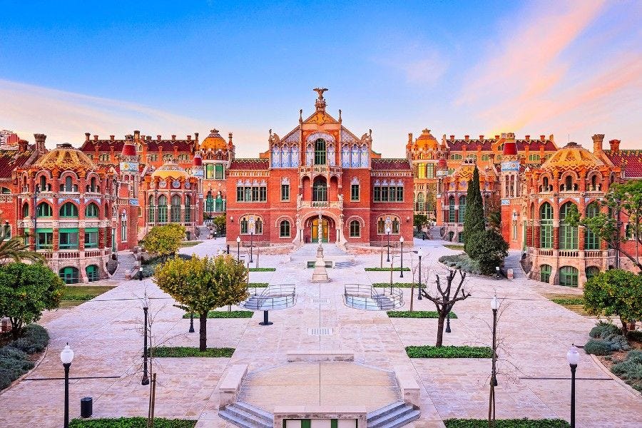
Some pictures of the hospital tend to look like this:

If this looks like out of a fairy tale, it’s because it is, or at least it’s right out of some software that allows you to tweak the saturation and brightness settings of your photo to make it more appealing. I can also play this game, and I tried it with the picture of the Administration Building above:
In real life, remember that Sant Pau is primarily made of brown brick. Highly saturated pictures may set the wrong expectations; I think they did, more or less consciously, for me. So the place seemed perhaps a bit more ordinary than it should have.
2. Despite this, it’s great and well worth a visit
The photo tweaks are totally unnecessary: the hospital is impressive even without exaggeratedly saturated colors.
I think the best part is actually the layout. As you can see from that super-saturated picture above, or from my picture of a scale model below, the hospital consists of a central plaza surrounded by a number of pavilions. Aside from the impressive Admin Building at the entrance, and the Surgery Building in the middle, most of the pavilions are arranged in two rows; they are where the patients would stay.
The result is a hospital centered on a peaceful, pleasant area, where one easily imagine patients strolling as they recover from their illnesses. As for the to-and-fro of nurses and doctors and other staff operating the facility, I gather that it mostly happened underground: the whole complex is connected through a network of clean, white-ceramic-tiled corridors underneath the surface.
The individual pavilions for the sick look like this:
That windowed round corner to the right is easily the best feature of the pavilions. It generally housed an amazing, sunny rest room for patients. I don’t have a good picture of such a room, but I do have one of its ceiling:
As for the main room of these pavilions, they used to be lined with beds and decorated with green flowery ceramic:

It somehow feels very hospital-y and yet rather beautiful, though a bit more basic than I expected.
3. You sort of get why they had to replace it with a more modern facility
Sant Pau does feel old. I don’t think modern hospitals tend to have large rooms full of beds like this with absolutely zero privacy. There were probably tons of outdated spaces and equipment by the time they finalized the move to an ordinary-looking hospital nearby in 2009.
Although it’s a bit sad that there isn’t such a beautiful hospital in operation today, it’s probably a better use of the complex to make it a tourist spot (and office space for some health startups).
4. Orange trees make everything better
For some reason my favorite detail was the orange trees in the plaza:
I feel I would heal 15% faster if I were sick near orange trees. Somebody should conduct a study on this.
Of course, the presence of citrus trees is more a property of Barcelona’s Mediterranean climate than of Domènech i Montaner’s moderniste architecture. Yet — I wonder if future hospitals in colder areas should look into building orangeries, with orange trees in pots and a heated room to shelter them during the winter, like all the European palaces used to feature, most notably Versailles. If you can’t move to a sunny climate to recover from disease, let the sunny climate come to you.
5. The nicest building was not for the sick
We already saw the façade of the Administration Building. Here are a couple shots of the interior:
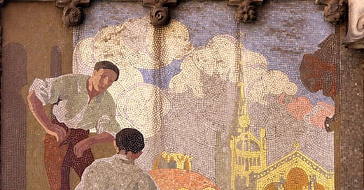
The exterior also features something like 16 mosaics that tell the history of the Santa Creu hospital from its medieval incarnation in the old city to its transformation into Santa Creu and Sant Pau after Mr. Pau Gil, a Catalan banker in Paris, bequeathed a large sum of money for the construction of a hospital bearing his name.
If I recall correctly from the explanatory signage, the Admin Building was the subject of some disagreement during the early stages of construction. The main reason to build a hospital in the Eixample had been to relieve the overcrowded medieval hospital, but Pau Gil’s will stipulated that the Administration Building had to be built first (or something like that, I’m hazy on the details and I can’t find this story on the web). Some of the staff at Santa Creu weren’t too happy that the builders were focusing on gorgeous stained glass and other luxuries for the Most Illustrious Administration (the totally humble name of the leadership committee of Santa Creu since the Middle Ages) rather than ensuring the sick could be transferred as fast as possible.
I’m not against giving management a nice place to work, but learning this did dampen my enthusiasm about this hospital being a model of surrounding sick people with beauty.
6. If it were in Madrid it’d be the best thing to see in the city
7. Catalan modernisme is really cool, but I can understand why it didn’t last
It’s pretty overwhelming. Excessive. I like excess, but, almost by definition, it cannot be applied everywhere. Sant Pau is special, just like the Sagrada Familia and other moderniste buildings across Barcelona are, because they’re only a few of their kind within a city that has dozens of other styles, almost all of which are much more mundane. And that’s good. You wouldn’t want an entire city built like this.
Not that such a city could ever exist. Art movements that are as exuberant as Art Nouveau tend to last only for a decade or two and therefore have a limited impact. Catalan modernisme began around 1890 and was basically over by 1910 (except for Mr. Gaudí still toiling on his special church until his death in 1926, and for others continuing the work well into the 2020s). The reaction came, like it always does, in the form of a sober, classical, almost conservative movement. In Catalonia it was called noucentisme. Modernisme began to be seen as a fad of the bourgeoisie. To be honest, it probably was.
Walking around Barcelona, the Gaudí buildings are fascinating and well worth a visit, but they’re also, well, clearly gaudy. Pun intended, alas.
As for Sant Pau: How did it happen? Was it worth it? Can we build more places like this?
It happened thanks to a rich banker named Pau Gil who wanted to leave, as a legacy, a hospital in his home city with his name, and whose large donation happened to coincide both with the planned move of a medieval hospital to the Eixample, and with an especially creative decorative movement all across Europe. It happened because Catalonia was emerging from a kind of cultural renaissance at the time, trying to define and extend its own identity as a nation within Spain through the arts, including architecture. It happened because Lluís Domènech i Montaner, a famous architect and professor, had an innovative vision for it.
It was worth it, because it gave us a wonderful building that is now considered part of World Heritage by UNESCO. Also, I don’t have hard data on this, but I am led to understand that Sant Pau was considered a good hospital throughout its lifetime. Despite a bit of a conflict over prioritizing aesthetics vs. the welfare of the sick, it seems that Sant Pau achieved both.
But I don’t know if we can (or should) build more places like this. I left Sant Pau liking it less than I had expected. Maybe because some of the opulence seemed over the top. Maybe because one tires of constant flowery ornamentation and stained glass after a while. I still think that we should build more beautiful hospitals, and I’d be happy if there were a few more rich donors mandating certain architectural choices or builders trying approaches that differ from typical modern health centers. But we shouldn’t particularly want to emulate Sant Pau itself, except abstractly, in the sense of getting inspired by its uniqueness and boldness.
We should definitely put orange trees everywhere though. Orange trees are the best.


Paramedic: « We got a 33 yo male with an acute acitrussinensisnosis. »
Dr X: « Quick! Bring him to the orangerie! »
🍊
Casa Batlo and La Pedrera by Gaudi were actually built as social housing. La Pedrera is still in use. It’s actually a misconception that utilitarian architecture should be ugly. It’s a Le Corbusier theory that unfortunately took roots in our ‘modern’ culture. There where other competing views on how to build the modern city but inexplicably his won.
It’s not cheaper to build ugly hospitals. The main hospital in Vienna was a staggering 4.5 billion. It’s so ugly! Its construction turned into a huge bribery scandal.
Needless to say, I love Art Nouveau and as I was standing on the rooftop of Casa Batlo looking around at the world we built for ourselves I wanted to weep. And Barcelona is a beautiful city. You should see where I grew up.
Lovely article and photography. Thanks for writing this! 💚