All the cool bloggers routinely publish list of links to interesting internet content, so we’re going to try that here at AWM too. I have no idea if it’ll work well, but at least it feels good to build the habit of saving all those links!
I. The Analysis of Beauty is a book from 1753 that tries to lay down a theory of what beauty is. The author and artist William Hogarth identifies six principles: fitness, variety, regularity, simplicity, intricacy, and “quantity”, which Wikipedia related to “the sublime.” More interesting are the plates containing lots of specific examples discussed in the text:
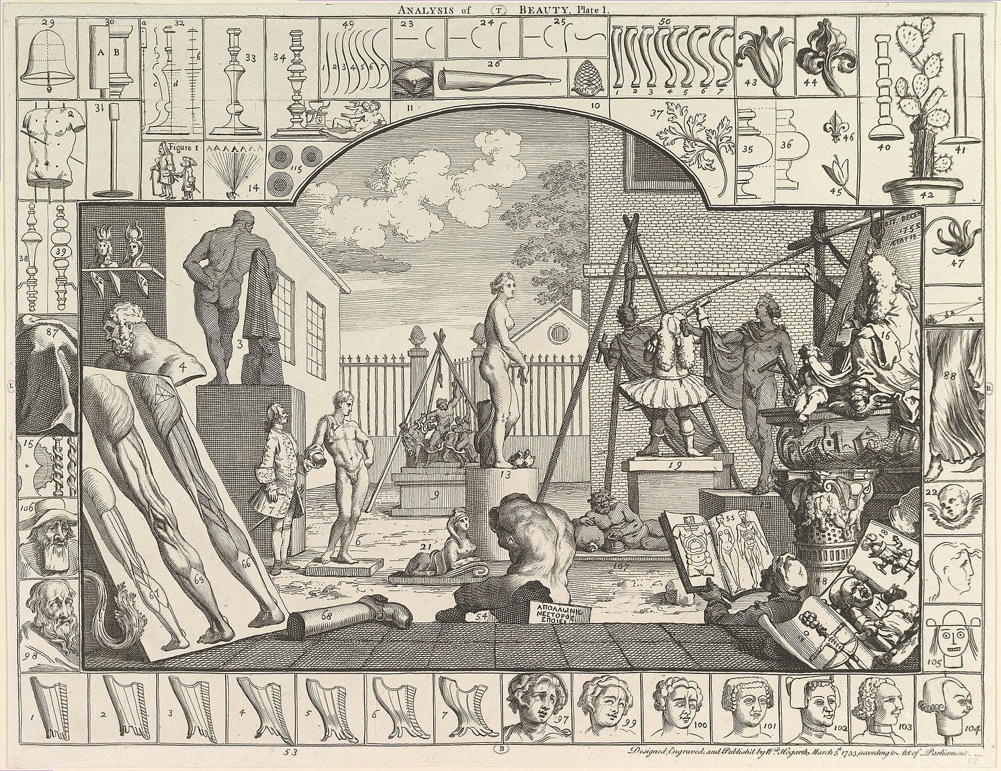
Special mention to numbers 104 and 105:
II.
published the results of his blogging contest. I entered the contest, but did not get mentioned. It’s fine — my submission was the fairly experimental piece I posted a few weeks ago, in which science fiction and history fight in the fashion of pro wrestlers. A concept that felt incredibly groundbreaking when I thought of it 15 months ago, but in retrospect the fact that it became an Eternal Draft and I couldn’t finish it without the deadline of a blogging contest was probably a sign it was far less interesting than I thought. Didn’t get a lot of likes, either.Do check out the entries that won or got honorable mentions though! And also, this small scale contest made me think there should be more small scale blogging contests. Maybe I should run a blogging contest??
III. Speaking of contests, the ACX Book Review contest, 2024 edition, just ended, with the review of Two Arms and a Head being crowned winner. My personal favorite was the review of Autobiography Of Yukichi Fukuzawa, but I also enjoyed the one on Silver Age Marvel comics, in large part because of its discussion of storytelling innovations with concrete examples, a topic I had previously visited here.
IV. Sort of relatedly, I wrote an almost essay-shaped comment on an ACX post about the importance of historical figures. The argument is half-baked but roughly that something like “innovation” is the main thing that matters.
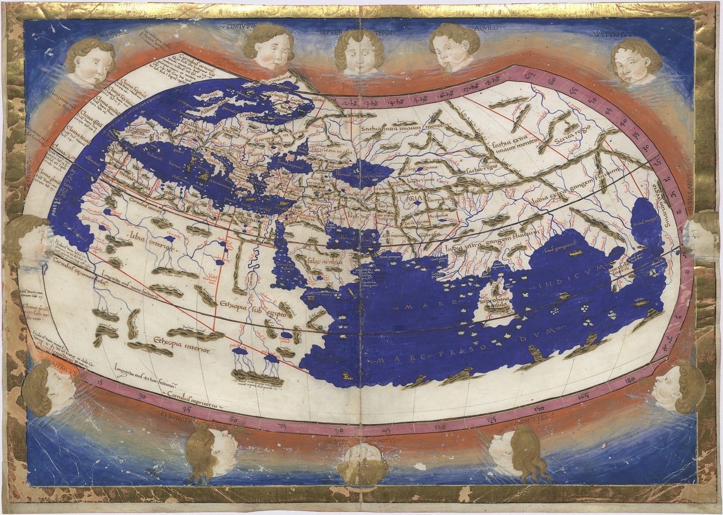
V. Noah’s Ark, as seen on a map of the Caucasus from 1545:
VI. Computational kindness (ultimately from Less Wrong) is one of those phenomena you never realized needed a word until you saw it. It means the kindness to make decisions easier for the people around you. E.g. give 2-3 food options, or even just one, instead of replying “I’m fine with anything!” when a friend asks you what you both should eat. Saying you’re fine with anything feels like offering them flexibility, but is in fact just putting the entire weight of the decision on them. (And if they had a strong preference they’d be suggesting that to you, rather than asking a general question.)
Of course if you’re tired (or don’t want to be kind!), you can say “I’m fine with anything.” But it’s good to remember that computational kindness exists, although I wish it had a better name than this. (I think it’s a really great name for those with a computer background but an absolutely terrible name for everyone else.)
VII. The Quebec Angle™️: I learned in Le Devoir (1, 2, in French) that the city of Los Angeles, California, apparently had a couple of mayors in the 19th century who came from Quebec and were unilingual francophones. Different times.
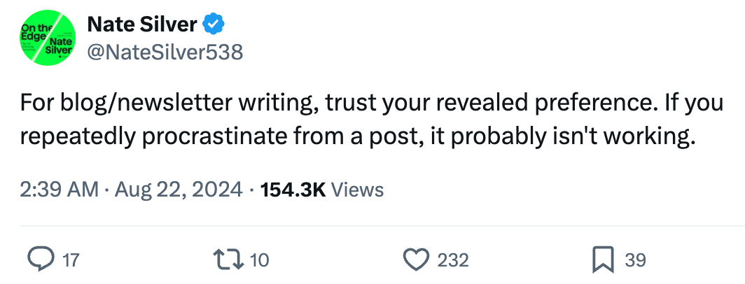
VIII. Nate Silver, whom I’m following these days because I get obsessed with the US election like any good election nerd, tweets that:
I tend to agree. A few of my recent posts were heroic attempts at finishing old drafts I’d been procrastinating on since last year. They turned out to be unpopular and I’m not very fond of them. Procrastination is a useful signal, in addition to being a practical method of transferring tasks from a low-motivation version of yourself to a high-motivation one.
… I’m not sure what it means that I have been procrastinating on this very links post for weeks months, though.
IX. Hiding messages inside of architecture is always fun, especially snarky messages about how the architecture is ugly.
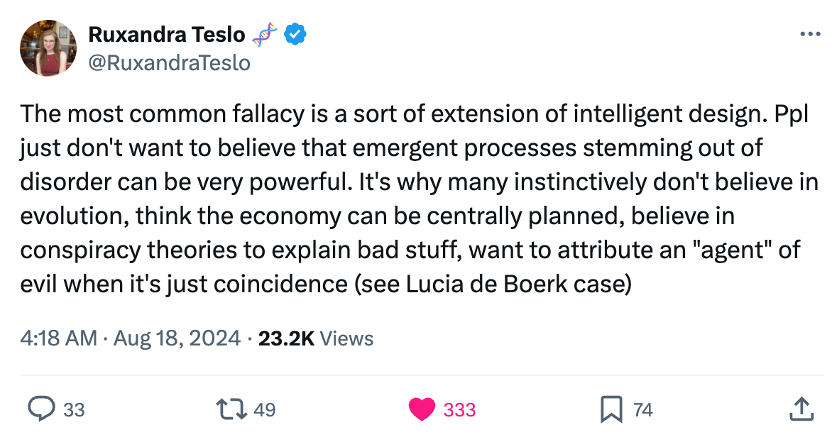
X.
’s tweet about emergent processes being unbelievable to lots of people, thus causing reasoning errors:Also an excellent unintentional distillation of like 50% of this blog.
XI. I recently read the classic dystopian fiction book Fahrenheit 451, which I was surprised to dislike so much. Barely any worldbuilding, a fairly underwhelming narrative, a basic feel good message along the lines of “books are important.” The author seemingly just thought the amusing prompt, “What if ‘firemen’ were tasked with lighting buildings on fire instead of putting fires out?” and tragically decided to turn that into a novel, thus wasting a few hours of my life. Anyway, the link here is that government employees tasked with lighting illegal buildings on fire is actually a real thing! It occurs in northern Quebec, and the buildings are hunting cabins that were illegally constructed on public land. The government burns them during winter so the fire doesn’t spread. It has nothing to do with illegally housing books.

XII. A common and tiring trope on Twitter: arguing that the US is better than Europe (especially in terms of innovation, personal freedom, or economic growth), or that Europe is better than the US (especially in terms of health, quality of life, or aesthetics). Usually this leads to very tedious back-and-forths, and so it was ironically refreshing to read this article by Palladium Magazine about how America and Europe Are Equally Poor.
XIII. I was curious to see if Mexico had any professional ice hockey teams. It does! All teams in its top league are apparently based in Mexico City, and they’re named after Mesoamerican civilizations: the Aztec Eagles, the Mayan Astronomers, the Olmec Stone Heads, the Teotihuacan Priests, and the seemingly new for 2024-2025 Tarascan Archers and Cholula Hunters.

XIV. Why do RVs / camper vans / camping trailers all have ugly swoosh designs over beige or white backgrounds? Still an unanswered question, but my asking the question led to many interesting hypotheses.
XV. Popular substacker Sam Kriss visits Chandigarh, the city in India whose master plan was designed by brutalist/modernist architect Le Corbusier, and finds it beautiful and lively. I love this post because it runs counter to the common narrative that modernism made cities worse. I especially liked this passage:
Critics have detected something deeply authoritarian in Le Corbusier’s efforts to replace all haphazard, organic, democratic forms with a world of summarily imposed right-angles and grids. The late James C Scott, for instance, made Le Corbusier one of the chief villains of his book Seeing Like A State. . . . Scott devotes a long section of his book to Brasilia. Chandigarh, meanwhile, barely gets a single page in my edition. This is strange, since unlike Brasilia, Chandigarh was designed by Le Corbusier himself, rather than his followers. Maybe the problem is that unlike Brasilia, Chandigarh works.
There’s also some good discussion of aesthetics, and Kriss asks the question: why is brutalist architecture so often disliked? It’s really not that clear. Just being made of concrete is insufficient: there’s no reason concrete can’t be beautiful. Kriss writes:
So far, I’ve never seen anyone actually explain why modern architecture is so intrinsically ugly. According to the traditional definition, beauty is symmetry, harmony, and proportion, and Le Corbusier’s buildings have all of those.
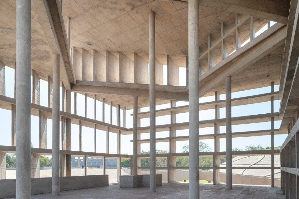
XIV. Since we’re talking about aesthetics, go take a look at Hirō Hisono’s art at The Doors of Perception. Highly endorsed.
XV. The Substack Talking Big Ideas published my old essay on obviousness as a guest post, and I promised I’d link back to them. Bob’s essay on awe and anxiety and the solar eclipse is quite good!
XVI. Fun to see my quirky experimental essay on strawmen inspired some of this post on strawmen in the AI risk debate.
XVII. I briefly mentioned in a post a few weeks ago the idea of higher-order sarcasm. It came from a post called A Taxonomy of Sarcasm, which is worth pondering some more:
First degree sarcasm: Saying what you don’t mean, and saying it insincerely.
E.g. “Oh! Now that was intelligent!” [said sardonically after something stupid is done]Second degree sarcasm: Saying what you don’t mean, but saying it sincerely.
E.g. “Oh, now that was intelligent.” [said in a complimentary way after something stupid is done]Third degree sarcasm: Saying what you mean, but saying it insincerely.
E.g. “Yeah, you’re a good friend.” [said in a mocking tone of voice to a true friend]Fourth degree sarcasm: Saying what you mean, and saying it sincerely.*
E.g. “Yeah, you’re a good friend.” [said in a matter-of-fact tone of voice to a true friend]
XVIII. Life (or God I guess?) randomly sent my way a copy of the Old Testament told with Legos, which turns out ultimately comes from this website called The Brick Testament. It was interesting to read, because I’ve always felt that I should know more of the Bible, considering how foundational it is to everything in this civilization, but I regret to report that the Old Testament very often makes zero sense and is excruciatingly boring, even when told in Legos. Maybe the Brick New Testament is better; I’ll wait for it to randomly and/or miraculously appear in my life too.
XIX. I love that there’s a wiki devoted to archiving organization logos: Logopedia. I’ve thinking of using its database to critically examine the common claim (e.g. here) that brands currently tend to be redesigned in a bland uniform style, which I suspect isn’t really happening outside of cherry-picked examples.
XX. A recent post by Samuel Hughes, Works in Progress’s resident writer on architecture and ornamentation, argues against the following theory: that ornamentation became rarer in the 20th century because it became cheap and therefore couldn’t be used by rich people to signal wealth. Hughes points out that the movement towards modernism was driven more by artists and intellectuals than rich people, who initially preferred classical styles. This seems correct, though I think he underrates the fact that changes in elite taste has taken several decades; a rich person in 1970 probably has very different tastes from a rich person in 1920. Whatever rich people desired circa 1900, at the very beginning of modernism as an experimental artistic movement, doesn’t really matter.
His other argument is that modernism spans many art forms other than architecture (painting, sculpture, classical music, literature) and the trends in cost are different in each case. Thus the wealth signalling argument can’t explain everything. I find this unconvincing: it’s totally possible for these forms of modernism to have different causes, and only later having been grouped as “modernism” due to their temporal coincidence or intellectuals wanting to find links between them. It’s possible that wealth signalling became weaker first in architecture, where the impact of mass production on decreasing cost would have been greatest, and only later spread to the other forms.
And I still think that my take, which says that it is the possibility of being cheap due to mass production that determines the status of intricate ornamentation, rather than its actual cost, is likely to be correct. Thus Hughes’s argument that marble sculptures are still expensive doesn’t really matter in a world where we can get cheap mass produced plaster ones.



Thank you for the links!
I generally don't care for Le Corbusier's works but the Tower of Shadows is quite nice and I was thinking about what was nice about it.
A common criticism of Brutalism is that the buildings can be copied and pasted anywhere, irrespective of their environment. But "Tower of Shadows" isn't like this, since it responds to how the Sun casts shadows on the particular location. Le Corbusier apparently created the building with this in mind: "it is possible to control the sunlight in the 4 corners of a building, play with it even in a hot country and finally obtain low temperatures." This seems very different from his plans for Paris, which seemed disconnected to the regional particularity of the city.
It's also nice how the Tower uses concrete in a less heavy-handed way? It's hard for concrete to be beautiful since it's like a thick block of rough uniformity, lacking depth or variation. But with the Tower, because the pieces are so thin and they're mostly just a frame to see through, the effect works. I'm contrasting this to the Chandigarh Capital Complex, which I think it is uncomfortable to look at because it seems like he's trying to make light, dynamic shapes with a material that is contrary to that purpose.
I read an anecdote recently from someone who taught an Urban Sociology course for many years. Their first assignment to students was always a comparison of Le Corbusier and Mole’s house from The Wind in the Willows — modernism vs. vernacular. He never asked them to take a side, but they inevitably did. He observes that for many years (this article was published in 2005), students strongly came down in favor of Le Corbusier, but more “recently” they had been in favor of Mole, and in the intervening period they felt deeply confused about what they should approve of (introductory architecture students trying desperately prove that they were what they aspired to be). Yet despite their diametric opposition, neither side ever completely won out.
I think both styles have their better and worse executions, and that makes all the difference. Modernism can feel brutal or resplendent, vernacular can feel shabby or cozy. I would perhaps put this in terms of micro-fit (does the individual fit within the confines of the architecture) and macro-fit (does the architecture fit within the confines of its surroundings).