It is the time for “2022 In Review” posts, and I’m going to do this by ignoring the text content of all my essays and just focus on the artwork.
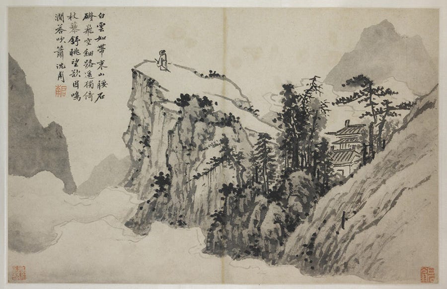
Sometime last June I landed on what became a core aesthetic principle of this blog: each post would display at least two artworks that relate in some way to the essay, one at the top and one at the bottom. I first did this for what is still my 2nd-most popular post, Remaining Ambitious. Back then, I tried to have at least one nice illustration per post to make the social media previews look nice. Since the essay used mountains as a metaphor for ambitious deeds, I looked for art of mountains, and found this delightful painting by Ming Chinese painter Shen Zhou, which really evoked a guy who just stopped caring whatsoever about ambition:
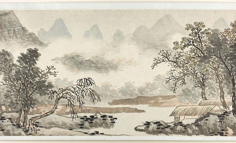
I explored Shen Zhou’s work some more and decided it would be nice to conclude on one of his other paintings, because it captures a particular atmosphere so well. (This wasn’t a post written at a moment of overflowing joy, as you might guess.)
Shortly after, I decided to systematically add two old paintings in each post, and I’m really glad I did. Building an aesthetic is important, I think, to any blog or indeed any media. Today I thought I would reflect on how I pick the art.
There are a few principles that guide my choice of artwork: they have to be thematic, copyright-free, diverse, and human-made. Let’s elaborate on each.
Obviously, the art should always be thematically linked to the post. Usually that’s fairly easy, except when I write about writing (pictures of people writing stuff are boring) or very abstract topic like ethics. More interestingly, the two artworks should be thematically linked to each other.
There’s something fun about finding pairs of artwork. Most of the time I don’t think about it too much and just pick two paintings by the same artist, assuming they both fit the topic. Other times the link is due to the country of origin, or the period or genre. For example, “medieval paintings that are related to bread”:
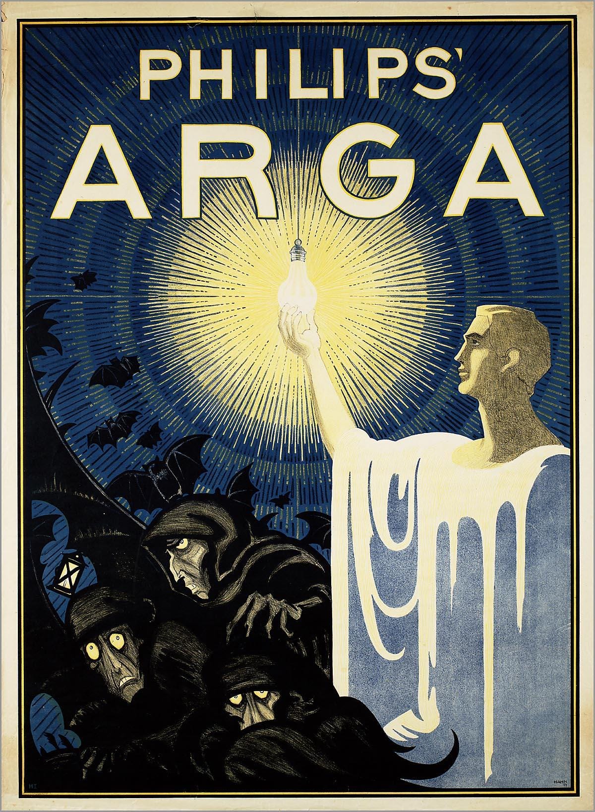
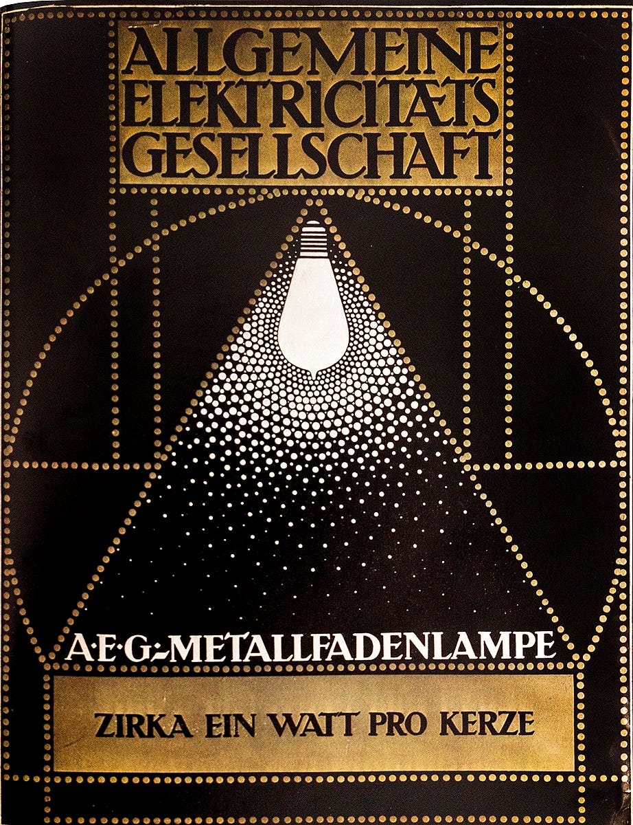
Or “ads for lightbulbs from a time when lightbulb where new and a big deal, commercially”:
To avoid any potential trouble with copyright, I decided early on to use public domain works. What I hadn’t necessarily realized from the onset is that this principle has important aesthetic consequences. Even though the public domain era comprises everything from Prehistory to the early 20th century (plus a few later artworks that were voluntarily released from copyright), the mere fact that most of the art is old creates a unified aesthetic. My blog, I think, looks a bit vintage. It has the yellowish tint of aged works. I am very pleased with this, as coherence is an important component of beauty.
But despite my desire for coherence, I also want diversity. I strive to display art from all times and places. In fact, I think about this probably way more than I should (which isn’t too surprising since cultural diversity is one of my longstanding obsessions).
To the extent that this blog is an art gallery, I want it to be one of those epic art museums that seek to cover the entirety of human history — the Paleolithic, the Bronze Age, classical antiquity, the Middle Ages, and the major movements of the modern period — and geographic extent — China, Japan, India, the ancient Middle East, pre-Columbian America, and many European and Western countries.
I notice that there are still many times and places I haven’t represented: the Muslim world, for instance. There’s also very little from the Indian subcontinent, from South America, and from Africa outside of Ancient Egypt. I’ll get there eventually. (Unfortunately, cultures that didn’t produce much two-dimensional art in the public domain are unlikely to find themselves here.)

A big development that happened in 2022 is of course that AI-made art became mainstream. As I wrote back in April, I was at first rather cautious about it, or even slightly hostile, and so I decided to never use AI to create the main artwork for any of my posts. It was easy enough to predict that a lot of bloggers would soon start prompting DALL-E and Stable Diffusion and Midjourney to illustrate their posts. It’s understandable: finding good pictures for a post is a constant annoyance to anyone who’s better with words than with design and art.
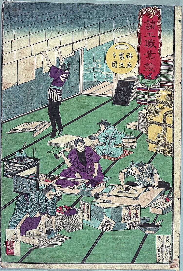
After my opinions evolved and I became more favorable to AI art, the temptation to use it has become strong. But I have resisted, and will continue doing so. Even in a post that discussed the process of finetuning a model and illustrated that with dozens of examples of AI art I generated, the two main artworks had to be human-made (illustrations of the traditional Japanese woodprinting process):
If you write a blog and use AI art, that’s perfectly fine — it’s better than a generic copyrighted stock photo. But do be careful; I fear that without a lot of creative vision, it’ll be easy to become indistinguishable from the morass of low quality pictures humanity is going to generate more and more in 2023 and beyond. For my part, I’m going to keep playing with the constraints of public domain human art.
Given these four criteria, how do I find the art I want? I have decent art history knowledge, so I’m often able to just think of an artist or painting that fits what I’m writing about. One recent essay that was very easy to illustrate was my post on slippery slopes: the icy Dutch landscapes of Hendrick Avercamp were just perfect, and in fact I thought of them as I was drafting the essay in my head. They nourished the writing. This is the ideal case.
Other times, it’s less obvious what the art should be, and I end up searching a lot. My main source has been Wikipedia and Wikimedia Commons, which is kinda disorganized but has really helpful categories such as “Sharks in art” and overspecific categories such as “17th-century oil paintings of recumbent men at full length”. Lately I’ve also started to explore the resources curated by Simon Sarris here.
Occasionally I really can’t find anything satisfactory and I end up just putting up two pictures I like, such as (ironically) in this post about aesthetics.
Expanding the bestiary
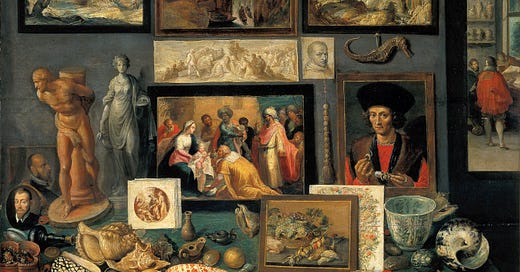
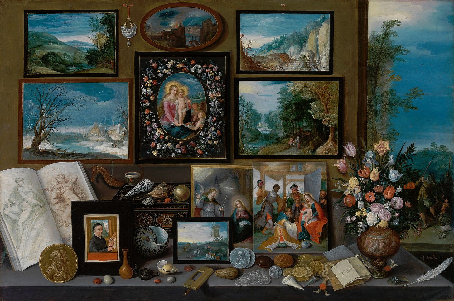
It feels like I’m slowly building a cabinet of curiosities, like aristocrats of yore, collecting paintings, but also seashells, coins, flowers, and random bits and pieces of exotic fauna.
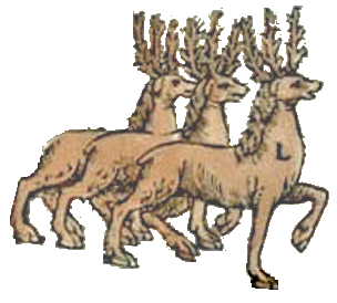
Besides the texts and the paintings, this blog also contains the little creatures from the Carta marina that separate the sections. To mark the new year, I’m making a few new ones, which of course involves awkwardly shaving a lot of pixels from screenshots I took of the map. You may have noticed the three reindeer, the bird nest, and the pair of snakes above. There’ll be a few more in the cabinet of curiosities as 2023 unfolds, whatever it may bring.
Happy new year!










Great post! Although I'm writing a weekly Substack myself, I find that I don't always appreciate how much work goes into other people's articles. It's also interesting to see how you see your Substack more like an artwork itself, or like an artfully and pleasingly arranged collection of curiosities. For me, the Substack page is more of a utilitarian vehicle for the thoughts and ideas in the text - but I can see how your approach would lead to articles that are more attractive on different levels. Thanks!